Many elements of an analytics project can be repetitive, time-consuming, and frustrating. Who truly enjoys importing data or cleaning up messy columns? With DataLab's new AI Assistant, you can spend more time doing what you enjoy: answering questions with data!
This article will cover 10 DataLab AI Assistant tips that can speed up your workflow and help you hammer out insights efficiently. If you want to follow along and experiment with the prompts contained in this article, you can use this workbook!
Note: Although the examples here are shown in Python, the same principles apply to R workbooks!
1. Automatically Handle All Your Package Imports
It’s likely that you have a few standard package imports that you know to write when starting a project. After that, you periodically scroll to the top of your notebook, add a few more lines of imports, and then resume what you were working on. Even more disruptive are the times that you need to visit external documentation to remember the name of a package or function you have forgotten the name of.
However, did you know you can use the Generate feature to generate most of your imports? Even a simple prompt such as “Import all of the packages I will need to perform a machine learning classification task.” returns pandas, NumPy, and some imports to split your data, fit it to a few models, and then evaluate it.
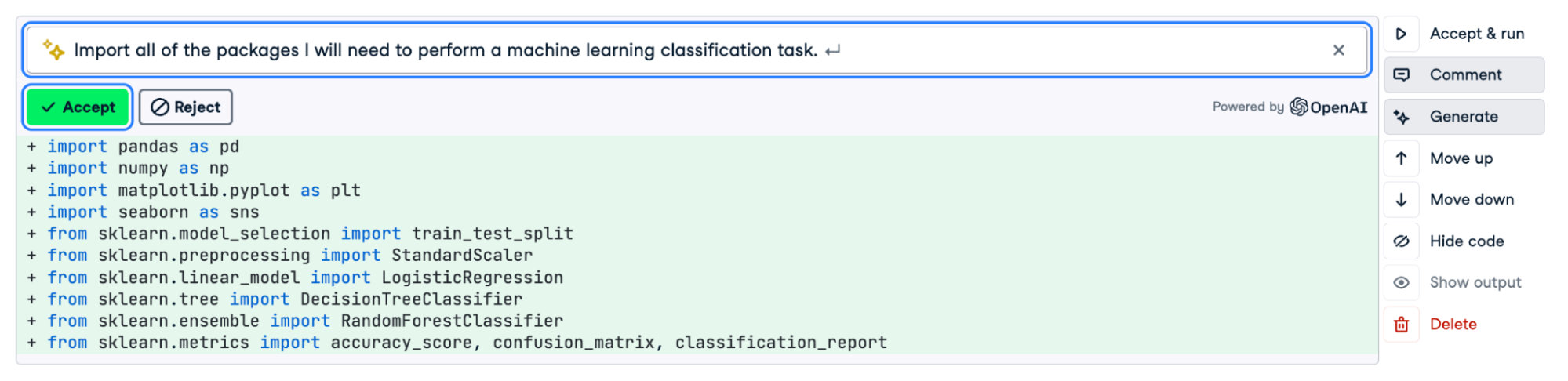
Using Generate to import useful packages
You can also augment the prompt to include additional stages of your workflow. In many cases, you may want to append “including visualization” so that packages like Matplotlib and Seaborn are included.
Of course, there may still be imports missing from the list, but it will already save you time importing the basics and can be updated based on your needs.
Additional tip: It can often be helpful to record what prompts work best for you so you can refer back to them quickly!
2. Build Beautiful Visualizations Faster
Visualizations in Python aren’t hard, but it can be time-consuming to remember the syntax for different packages. The AI Assistant again comes to the rescue!
In the example below, we instruct the assistant to aggregate a dataset and then visualize it using the prompt “Create a Plotly bar plot of the DataFrame df, ranking the 10 most common jobs in the job column.”
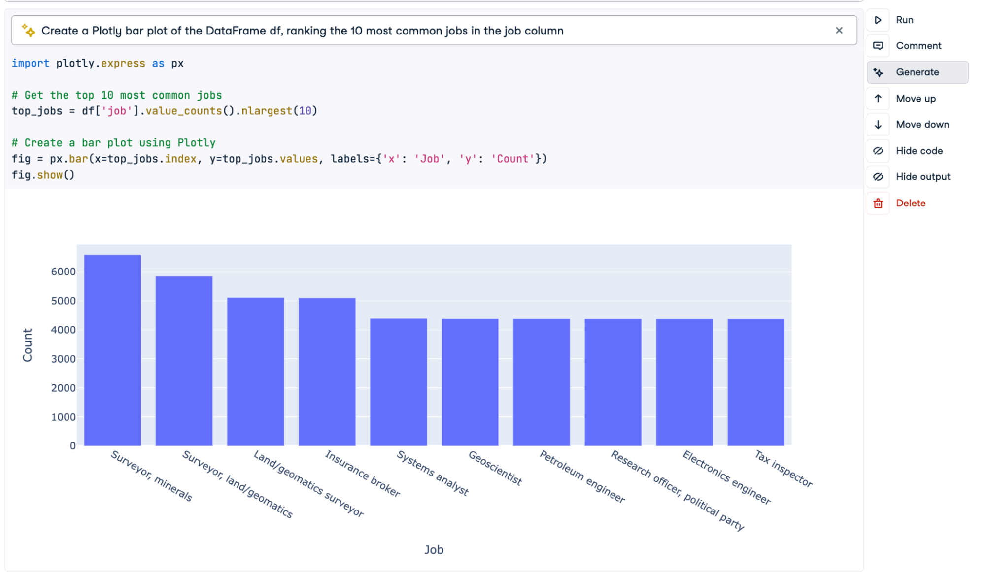
Using Generate for the first iteration of our plot
The result is not bad, but we can do better. You can use Generate again to iterate on the code it has generated! By writing “Make the chart a horizontal bar chart ordered from greatest to smallest. Add a relevant title, and use a simple white theme.” in the prompt window and running again, we get the following output.
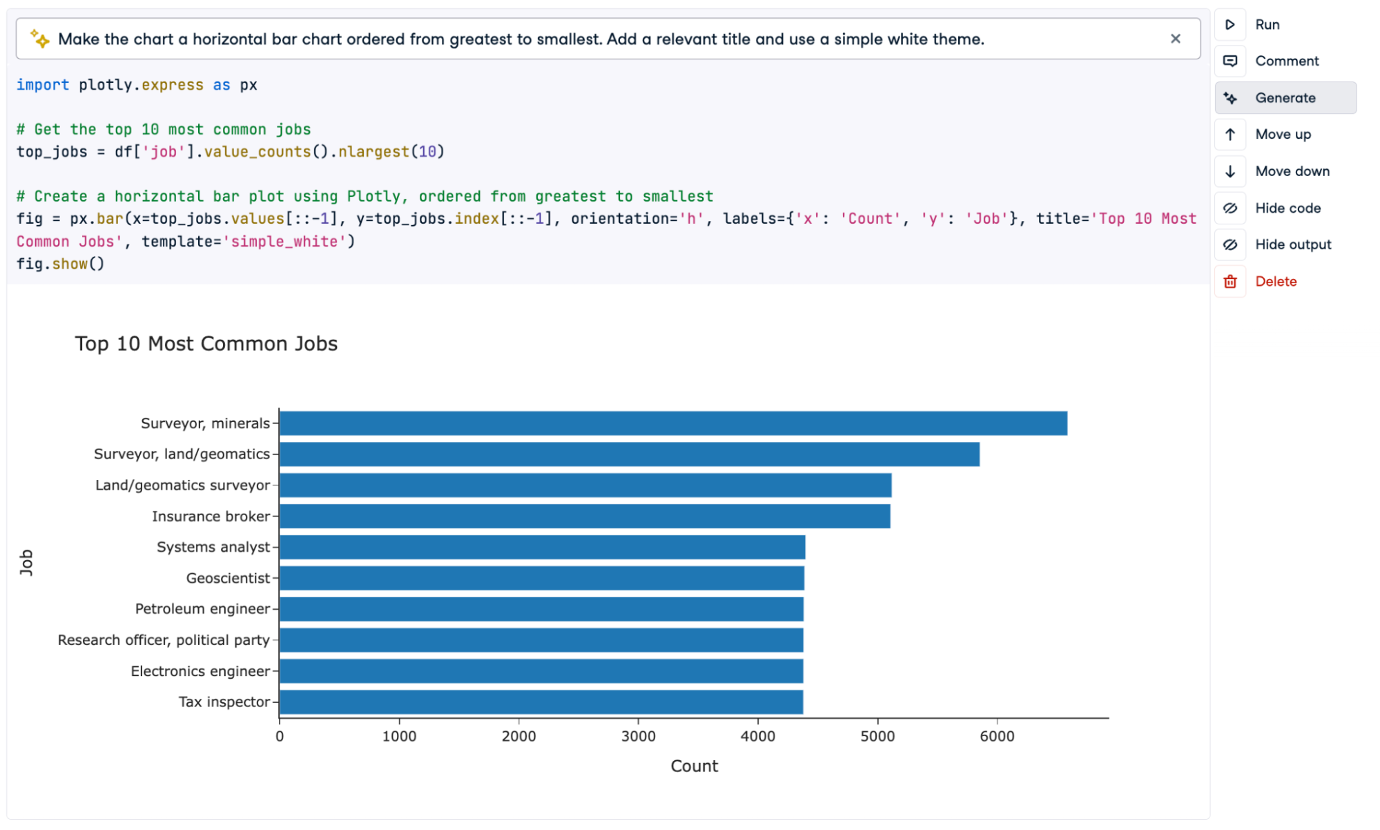
Second round of generating a chart!
Much better! With a couple of sentences, we produced a clean and informative chart, complete with labels and custom styling.
Additional tip: This is most effective when combined with manual tweaks to the plots. The AI Assistant will often get you 90% of the way there, but the final 10% will probably come from your own modifications! Be sure to use DataCamp’s visualization courses to learn your preferred visualization package.
3. Speed Up Your SQL
DataLab allows you to seamlessly switch between querying SQL databases and analyzing the results in Python or R (you can now even use SQL to query CSV files!). However, writing a well-formatted SQL query can be a time-consuming process.
You can also use Generate on SQL cells to write your queries for you. Because the AI Assistant has access to the database schema, it will even use relevant columns.
In the example below, we simply requested a ticket count for the 10 most popular events without specifying table or column names. This returned a query that joined the two necessary tables (event and sales), aggregated the qtysold column, and returned the 10 most popular events in descending order. It even provided a helpful alias to the outcome column!
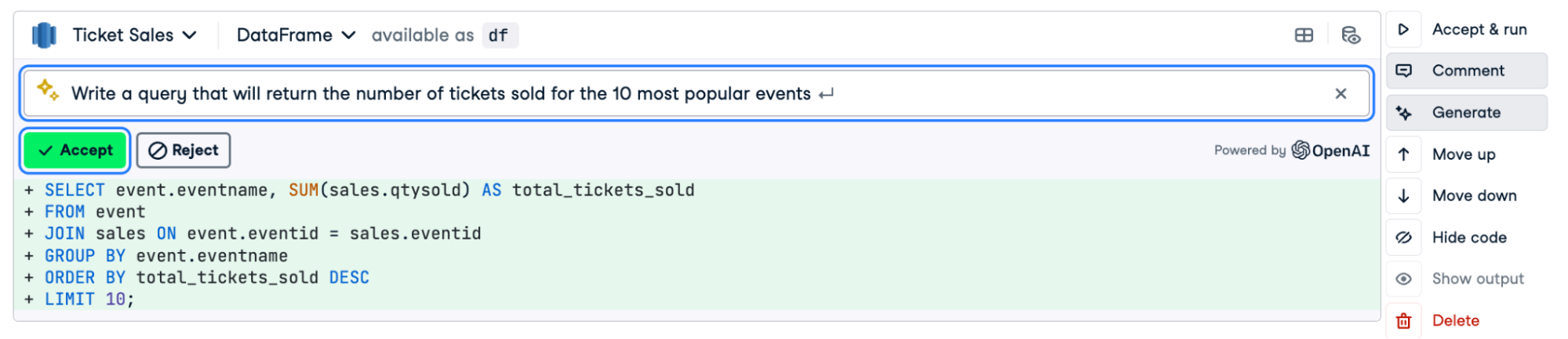
Instant query!
4. Write an Introduction
Using Generate on a text cell can help you to get started on the written sections of your report. A prompt such as “Write an introduction for a machine learning project focused on identifying instances of credit card fraud. Be sure to include why this is important.” can already return a solid introduction that you can then tweak to your specific circumstances.
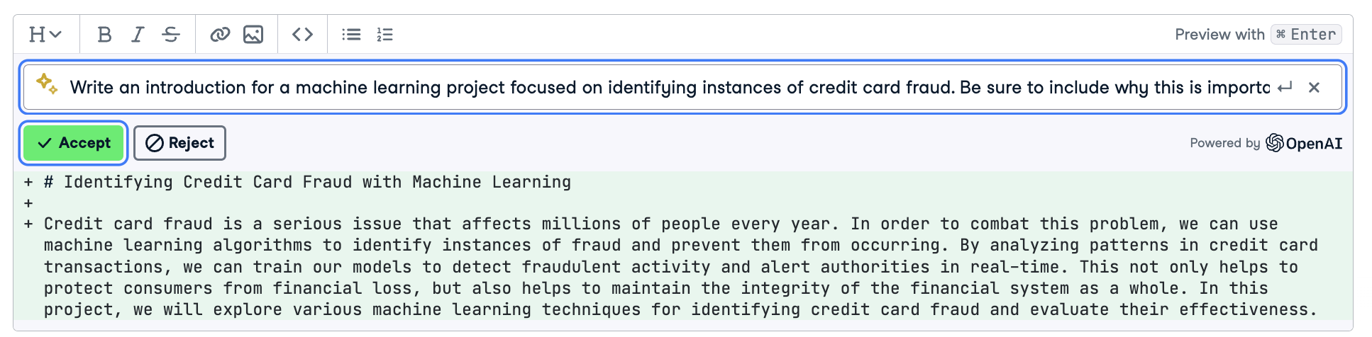
Instant introduction!
5. Format Your Code
In the midst of an analysis, it’s very easy to get sloppy with your code. Indentation suffers, extra white space appears, and lines become long and unwieldy. While you may be able to decipher your work, others may not. There are a lot of advantages to adhering to standardized code formatting.
Fortunately, you don’t have to manually format it yourself! A simple prompt inside of a text cell can easily handle all your formatting issues.
Before submitting a report, go through each code cell and run a prompt such as “Format this code according to PEP 8 standards.” This can help you quickly clean up your code, such as adding/removing whitespace where necessary, ensuring newlines are used correctly, and generally making your code more readable.
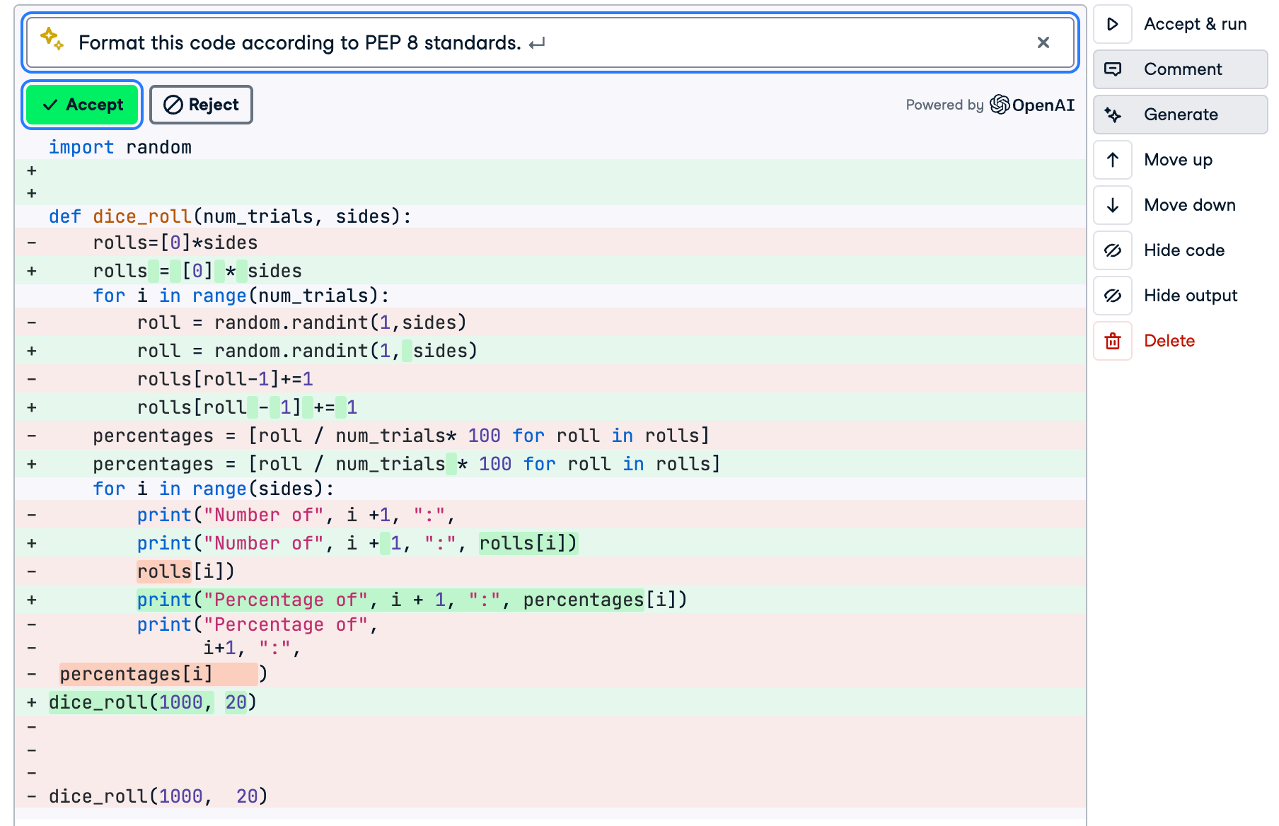
Using Generate to format our sloppy code!
6. Create Sample Datasets
We are taking inspiration from our own Richie Cotton here, who used this as an example in his article on accessing the OpenAI API with Python. In the article, Richie shows how to use the API to return the code to generate a sample dataset.
As he notes, a sample dataset is incredibly useful for things like validating code and practicing different techniques. While he uses the OpenAI API, you can do the same thing with a Generate prompt!
Simply write out the type of dataset that you would like generated, including the information you want to be included.
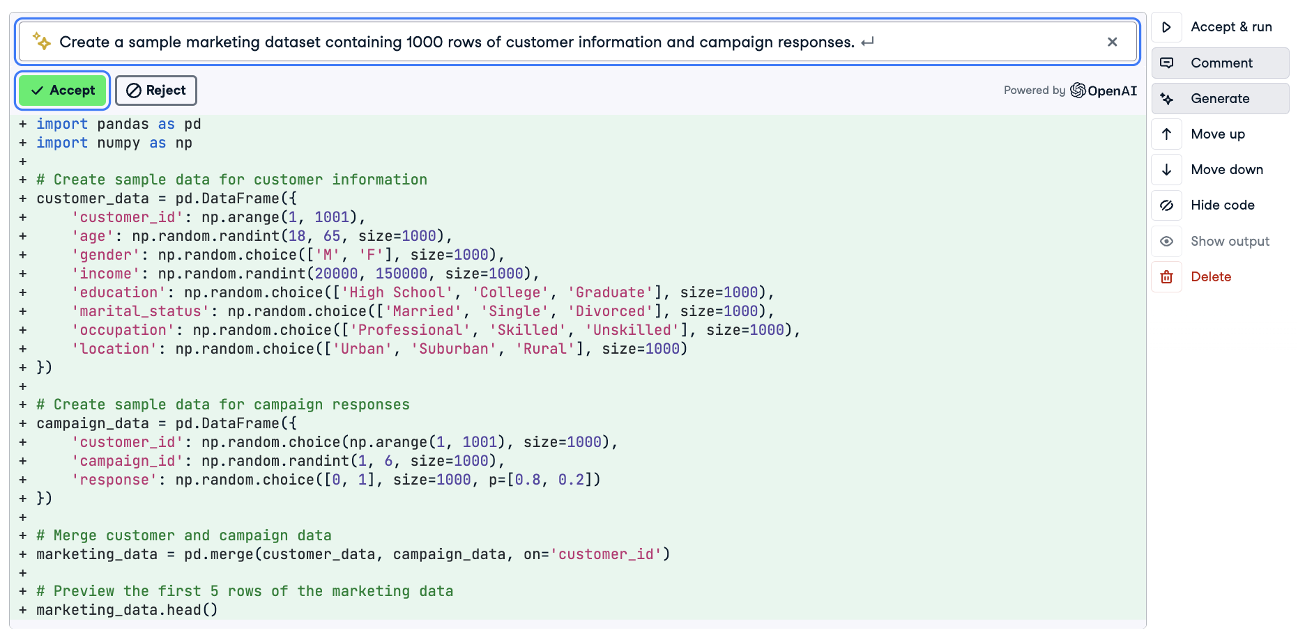
Generating a sample marketing dataset
Warning: Be sure to specify the number of rows you would like. A prompt without a length may return a sample dataset with only five rows of data!
7. Refactor Your Code Into Reusable Functions
A good rule of thumb is that if you intend to perform a task more than twice, you should write a function. Using Generate, you can quickly convert your loose code into a working function.
In the example below, we take some code to generate and plot a random walk and convert it to a function. Better yet, we ask it to also include some parameters which allow us to control the number of steps and the step size.
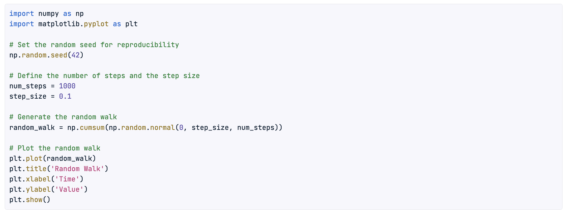
Loose code
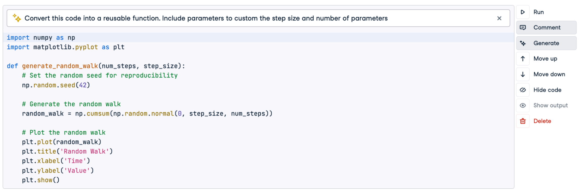
After using Generate!
If you want to iterate on the function, you can further tweak it with additional prompts or jump in yourself using knowledge from a course like Writing Functions in Python or Introduction to Writing Functions in R.
8. Feature Engineering and Preprocessing
The code to initialize a preprocessing pipeline can be long and cumbersome. Generate provides you with the ability to rapidly set up a pipeline with very little tweaking involved.
In fact, because the AI Assistant is already primed with your DataFrame, it can set up the pipeline with relevant variables in mind. Below we used the prompt “Prepare a pipeline to scale numeric variables and one-hot encode categorical variables.” to generate this full workflow.
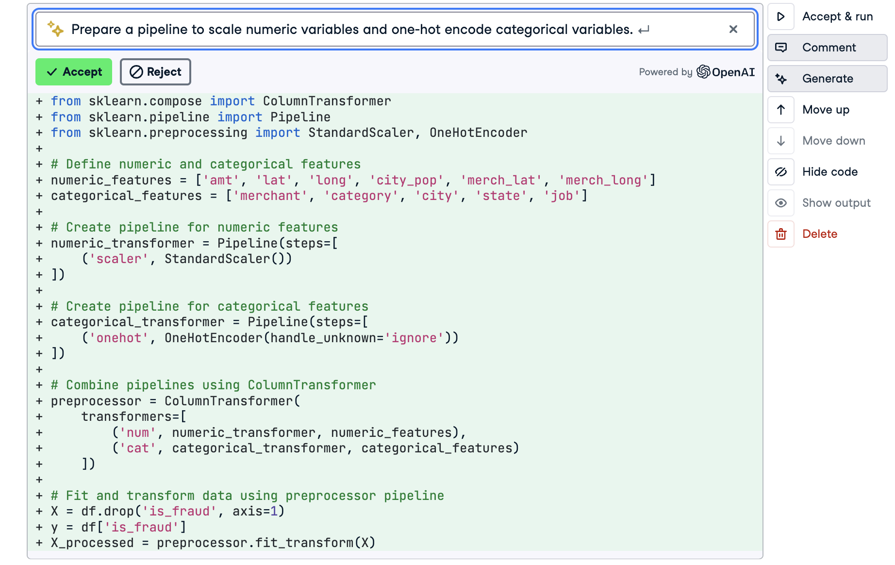
Using Generate to initialize a pre-processing pipeline in Python
9. Get a Jump Start on Hyperparameter Tuning
Hyperparameter tuning can be a great way to squeeze some additional performance out of your machine learning models. But there is often a lot of code required, and it can be difficult to remember what parameters to tweak.
This is another instance where the AI Assistant can save you a lot of time. Simply specify the type of model you want to tune, and Generate will take care of the rest. In the example below, the AI also takes into account the DataFrame we have been using and sets up the tuning with the is_fraud column as the target variable.
Note: We recommend you already have some knowledge of hyperparameter tuning before using this. That way, you can evaluate and adjust things such as which parameters to include. DataCamp has two great courses in Python and R on the subject.
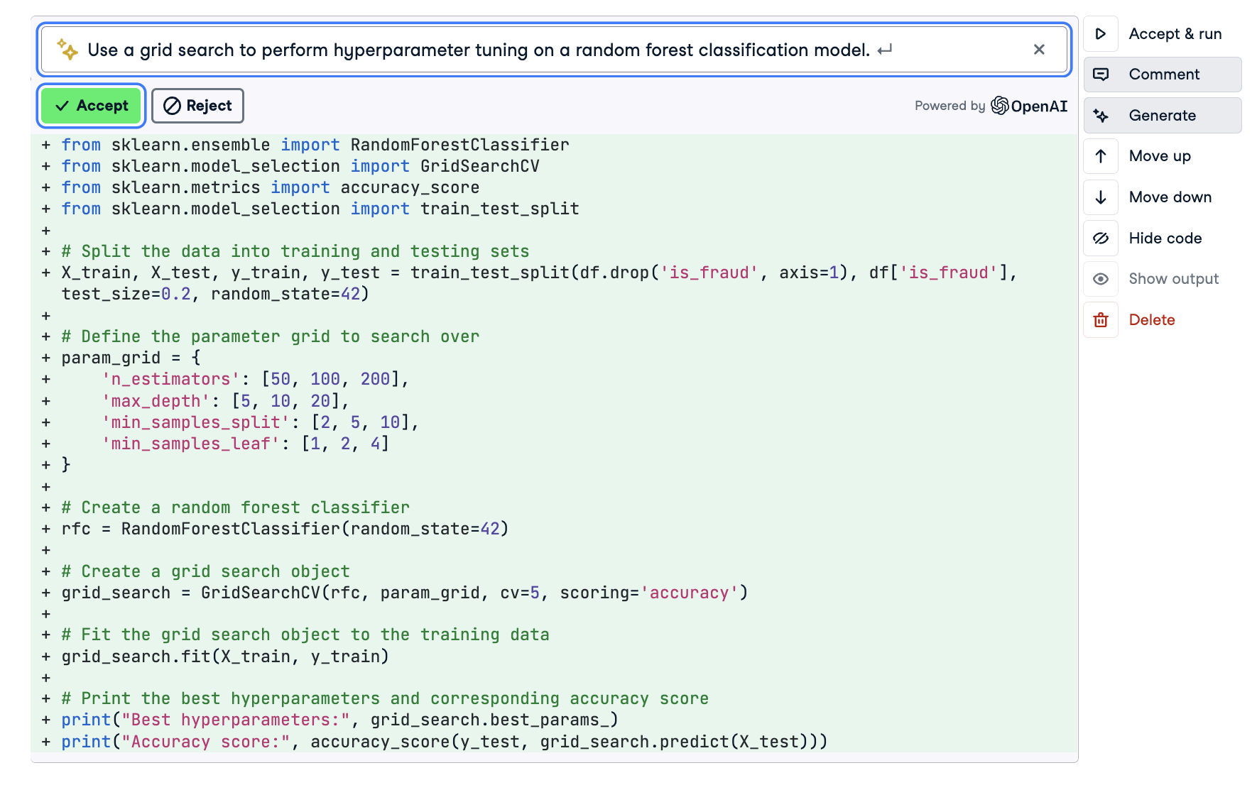
Hyperparameter tuning with the AI Assistant
10. Translate and Interpret Model Results
You have fit a machine learning model and evaluated its performance. Although you have no problem interpreting the results, non-technical users might struggle to follow along.
You can use Generate to help you interpret your results for a broader audience. In the example below, we share the precision and recall of a classification task and ask the AI to interpret the results in the context of predicting customer churn.
Be sure to sense-check the result and compare it with your own knowledge of the subject. But more often than not, a prompt like this can help you distill your results for all stakeholders.
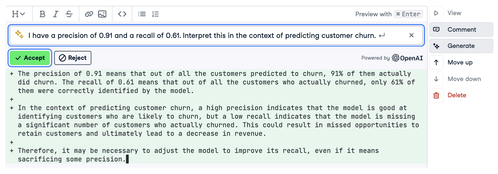
Interpreting classification metrics
Going Forward
The possibilities with the new AI tools in DataLab are nearly endless. Be sure to experiment constantly, as you will eventually build up a toolbox of prompts that you rely upon to speed up your workflow. Feel free to modify the prompts in the accompanying workbook or create a new blank Python or R workbook.
But watch out: do not use the output of the AI assistant blindly. AI-generated code can be incorrect in obvious and subtle ways. Always sense-check your results, and have a solid understanding of what you are trying to achieve. For example, does the generated query use the correct columns? Does the preprocessing pipeline transform the variables you want to transform and in the way you have decided to transform them?
The AI Assistant is a tool and not a substitute for practical knowledge. While the AI Assistant might provide helpful advice or syntax, the final outcome is your responsibility. For this reason, we recommend you also make sure that you are knowledgeable about the topics you use the assistant for. DataCamp’s course library is a great way to keep on top of the skills and techniques that you plan on using.
Further Resources
If you want further inspiration, be sure to check out our article on prompt engineering as well as our Cheat Sheet for ChatGPT, which contain many prompts that can be used directly inside DataLab.