Course
Introduction to R
4 hr
3M
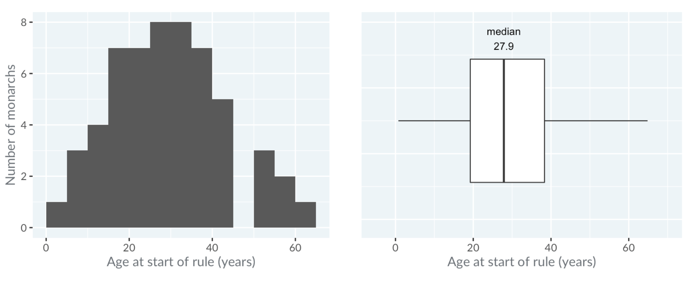
The boxplot() function shows how the distribution of a numerical variable y differs across the unique levels of a second variable, x. To be effective, this second variable should not have too many unique levels (e.g., 10 or fewer is good; many more than this makes the plot difficult to interpret).
The boxplot() function also has a number of optional parameters, and this exercise asks you to use three of them to obtain a more informative plot:
varwidth allows for variable-width Box Plot that shows the different sizes of the data subsets.log allows for log-transformed y-values.las allows for more readable axis labels.When you have a continuous variable, split by a categorical variable.
When you want to compare the distributions of the continuous variable for each category.
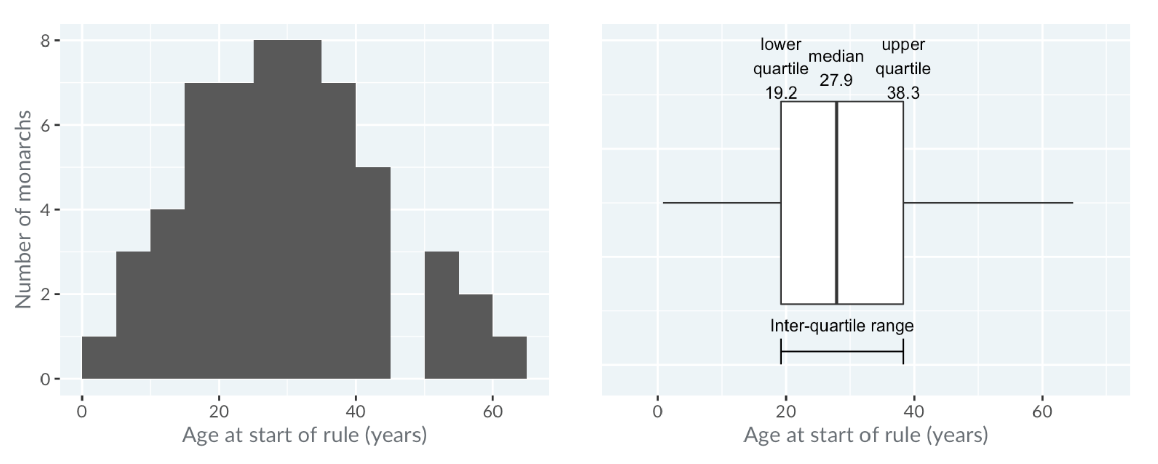
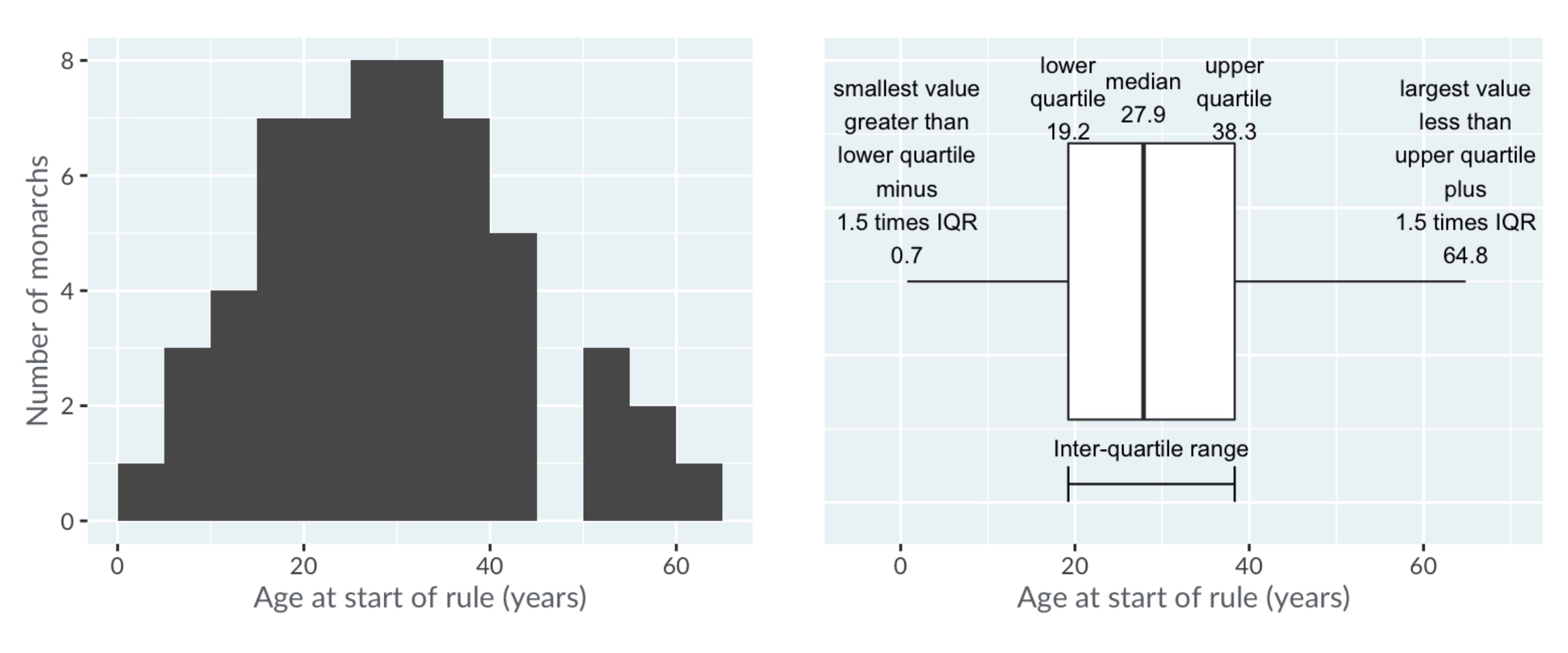
The horizontal lines, known as "whiskers", have a more complicated definition. Each bar extends to one and a half times the interquartile range, but then they are limited to reaching actual data points.
The technical definition is shown in the image below, but in practice, you can think of the whiskers as extending far enough that anything outside of them is an extreme value.
As mentioned before, the power of Box Plots is that you can compare many distributions at once. Here, the royal houses are ordered from oldest at the top to newest at the bottom.
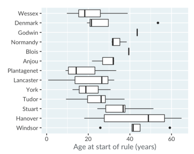
A trend is visible: since the Plantagenets in the fourteenth century, the boxes gradually move right, showing that the ages when new monarchs ascend to the throne have been increasing.
Godwin and Blois appear as a single line because there was only one king from each house. The Anjou house only had three kings, and forms a box with one whisker, not two.
Notice that the Box Plots for the houses of Denmark and Windsor show some points. These are extreme values, that is, values that are outside the range of the whiskers. Windsor's left-most outlier is Elizabeth the second, who ascended at age 26.
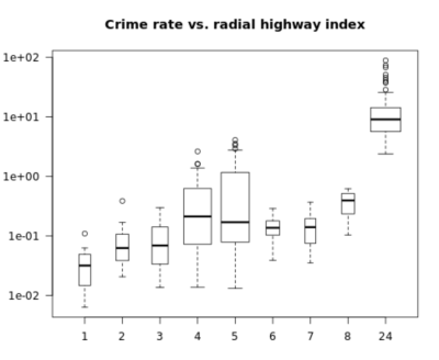
boxplot() FunctionIn the following example, using the formula interface, you will create a Box Plot showing the distribution of numerical crim values over the different distinct rad values from the Boston data frame. Then, use the varwidth parameter to obtain variable-width Box Plots, specify a log-transformed y-axis, and set the las parameter equal to 1 to obtain horizontal labels for both the x and y-axes.
Finally, use the title() function to add the title "Crime rate vs. radial highway index".
# Create a variable-width Box Plot with log y-axis & horizontal labels
boxplot(crim ~ rad, data = Boston,
        varwidth = TRUE, log = "y", las = 1)

# Add a title
title("Crime rate vs. radial highway index")
When we run the above code, it produces the following result:
To learn more about Box Plots, please see this video from our course Understanding Data Visualization.
This content is taken from DataCamp’s Understanding Data Visualization course by Richie Cotton and our Data Visualization in R course by Ronald Pearson.
Learn more about R
Course
Course
Course
Tutorial
Karlijn Willems
Tutorial
Kevin Babitz
Tutorial
Kevin Babitz
Tutorial
Karlijn Willems
Tutorial
Carlos Zelada
Tutorial
DataCamp Team