
Course
Introduction to Tableau
6 hr
306.1K
Effective data storytelling requires us to distill complex information into a simple and compelling narrative. Tableau excels at this by offering one of the best no-code solutions for data storytelling.
Here, we will review one especially important (and underused) visualization, the waterfall chart. We will learn about the waterfall chart's unique place in the data analysis toolbox, how to build it in Tableau, and how to customize it for any use case. Let’s dive in!
A waterfall chart, shown below, is a special type of bar chart designed to show the cumulative effect of positive and negative values on an outcome. It's especially useful for visualizing the progression of data through a sequence of changes, providing a clear picture of how different factors contribute to a result over time.
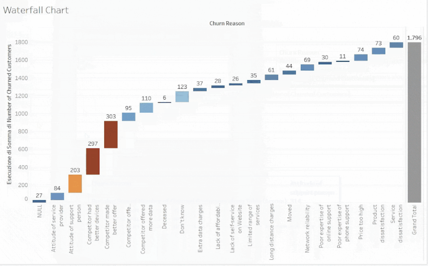
The waterfall chart we will be building in this tutorial. Image by Author
Here is the basic idea of a waterfall chart: We take an initial value and display it (usually) on the left-hand side of our graph. We then show how this value is affected by positive and negative changes over time or some other indicator, which we read in the chart by moving left to right.
The changes are seen as continuously stretching or shrinking our initial value. The cumulative effect of all these changes is displayed as a step-like pattern that resembles a waterfall flowing upwards or downwards. In this way, waterfall charts take their name because, like a waterfall, we see something that is both static and changing at the same time.
There are many instances where we may want to use a waterfall chart to illustrate trends and relationships. Here are a few examples:
Let’s build a waterfall chart by using a fake dataset from a Telecom provider called Databel. The dataset can be found in the Analyzing Customer Churn in Tableau case study. The information for the columns in our dataset can be found in the Metadata sheet.
Our objective is to understand why customers are leaving Databel. Here, a waterfall chart will be a great way to illustrate the reasons for customer churn.
Before continuing, we recommend installing Tableau Public, the free version of Tableau. Doing so will help you follow this tutorial step-by-step. The four steps we consider, in order, are:
As a final step, after we have created our waterfall chart, we will add finishing touches by formatting our chart. We will change the label orientation, add color, add text to each bar, create a total column, and add a dynamic filter.
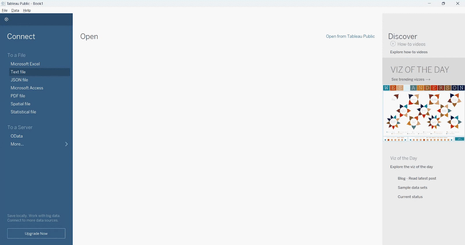
First, we need to import the Customer Churn dataset in Tableau. To do this, we go to the To File section. We then click Text File from the drop-down; finally, we open the CSV file called Databel - Data.csv. This will open a data preview, as shown below.
Importing our file into Tableau. Image by Author
We can see that Tableau, as a default behavior, doesn’t recognize the column names. We can fix this by selecting the Field names are in the first row option. We should also set Comma as a field separator. Our result will show the preview of a clean table, as the image below shows.
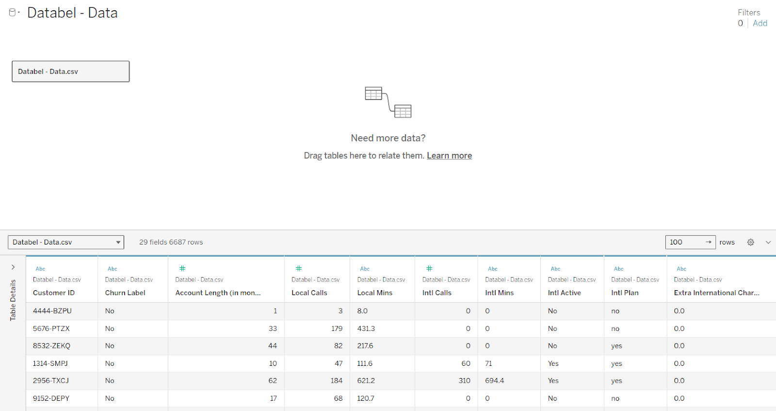 Our file imported into Tableau. Image by Author
Our data preview shows that our table contains 29 fields and 6,687 rows. For our purpose, Customer ID and Churn Label are the most important variables. Customer ID, of course, represents the unique ID for each customer, while Churn Label takes a binary value: Yes or No.
Keep in mind that, besides data visualization, Tableau is a data transformation tool that can be used to create new variables. In Tableau, creating new variables is known as calculating fields. To learn more about calculating fields, we highly recommend checking out the Calculations in Tableau Course to practice calculated fields right in the browser. Now let’s try our hand at creating these three calculated fields from Databel:
Let’s start with the first one. To create the Number of Customers field, we follow the steps below:
Go to the sheet.
Right-click on Customer ID.
Click Create followed by Calculated Field in the drop-down, which pulls up the calculated fields editor.
Create this name for our new variable: Number of Customers.
Type in our Tableau expression using the COUNT() function.
COUNT([Customer ID])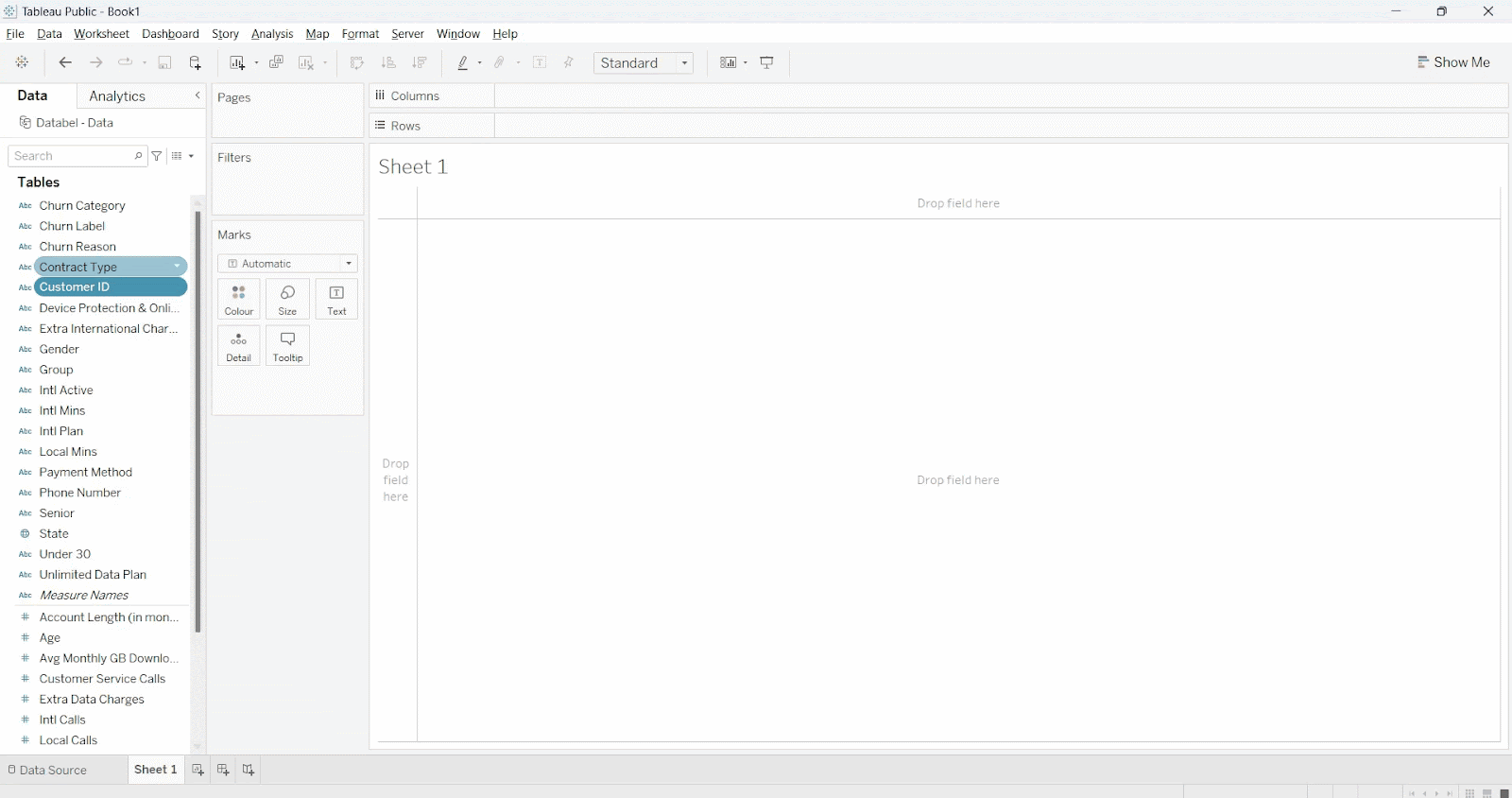
Our file imported into Tableau. Image by Author
Now, we want to convert Churn Label into a binary column by using another Tableau expression. We want values to contain 1 if the customer is churned and 0 otherwise. This step is important because we have to aggregate the total for each category, and to aggregate, the column must be countable first.
To create our second variable, we follow a similar procedure as before, except this time we use a conditional statement. To create the Churned field, we follow the steps below:
Churned Label.Churned.IF and ELSEIF functions.IF [Churn Label]='Yes' THEN 1 ELSEIF [Churn Label]='No' THEN 0 ENDFinally, to derive Number of Churned Customers, we aggregate the total from our newly-created Churned variable. To create Number of Churned Customers, we follow the steps below. This time we are using the SUM() function.
Go to the sheet.
Right-click on Churned Label.
Click Create followed by Calculated Field in the drop-down, which pulls up the calculated fields editor.
Create this name for our new variable: Number of Churned Customers.
Type in our Tableau expression using the SUM() function.
SUM([Churned])After completing the data transformation step to create new variables, we can visualize our data using a bar chart. This chart represents our first real look at the reasons why customers have churned.
As with any bar chart, we have to choose our axis labels. We place our Number of Churned Customers variable on the rows shelf, which is our y-axis, and we place Churn Reason on the column shelf, which is our x-axis.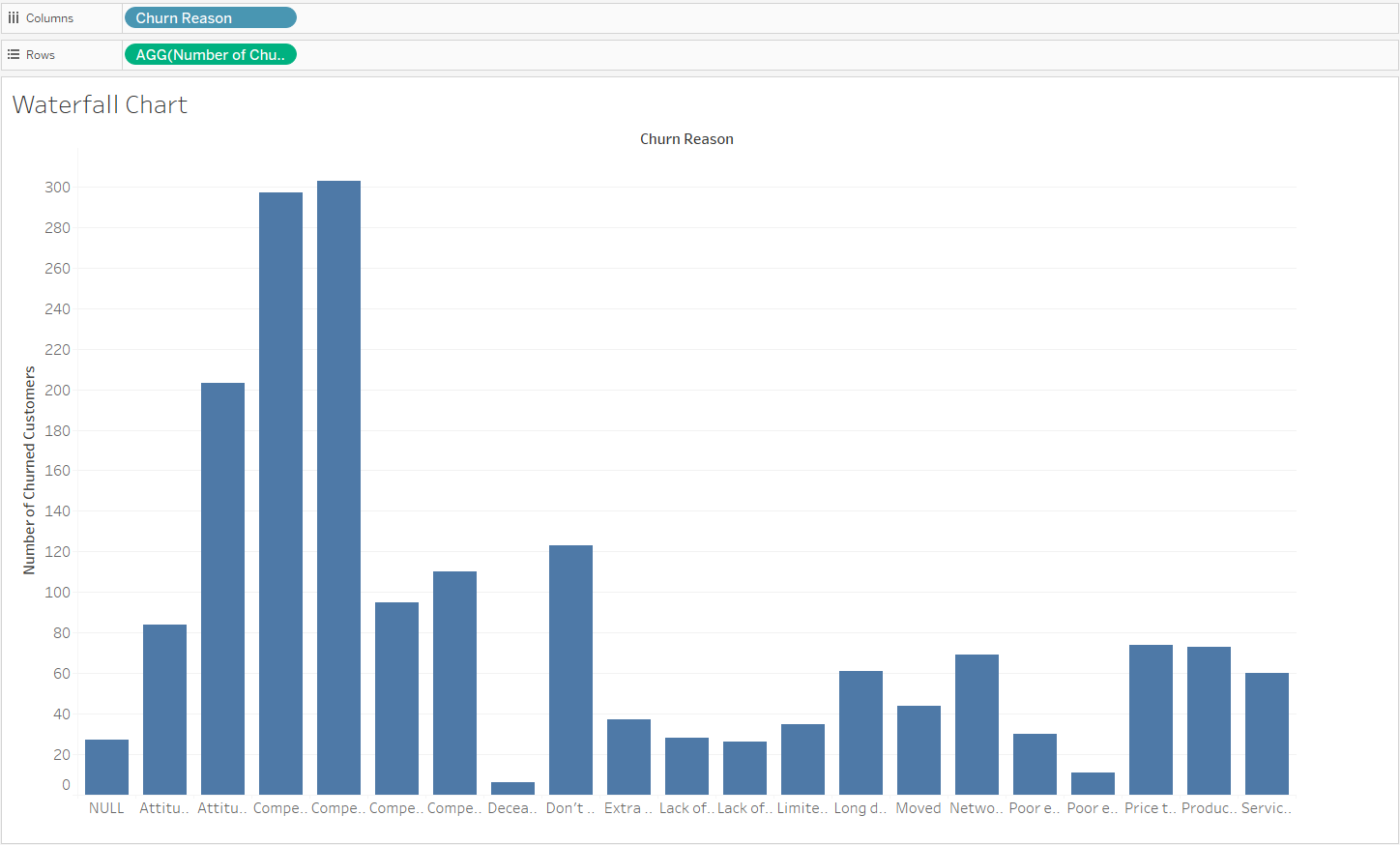 Our bar chart in Tableau. Image by Author
An important point to note: When creating our bar chart, Tableau automatically creates groupings for each Churn Reason when aggregating the total churned customers.
We now transform our bar chart into a waterfall. To transform our chart, we follow the steps below:
Go to the sheet.
Right-click the field on the rows shelf.
Click Quick Calculation followed by Running Total in the drop-down.
Change the Marks type from Bar to Gantt Bar.
We use our mouse to drag Number of Churned Customers so that it is in the Marks section.
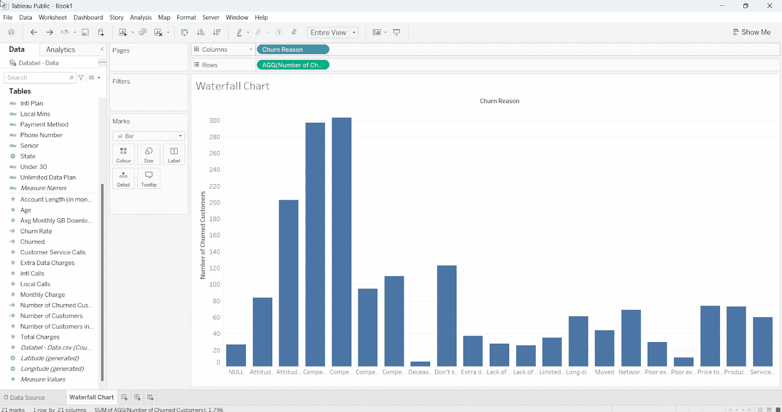
Our waterfall chart in Tableau
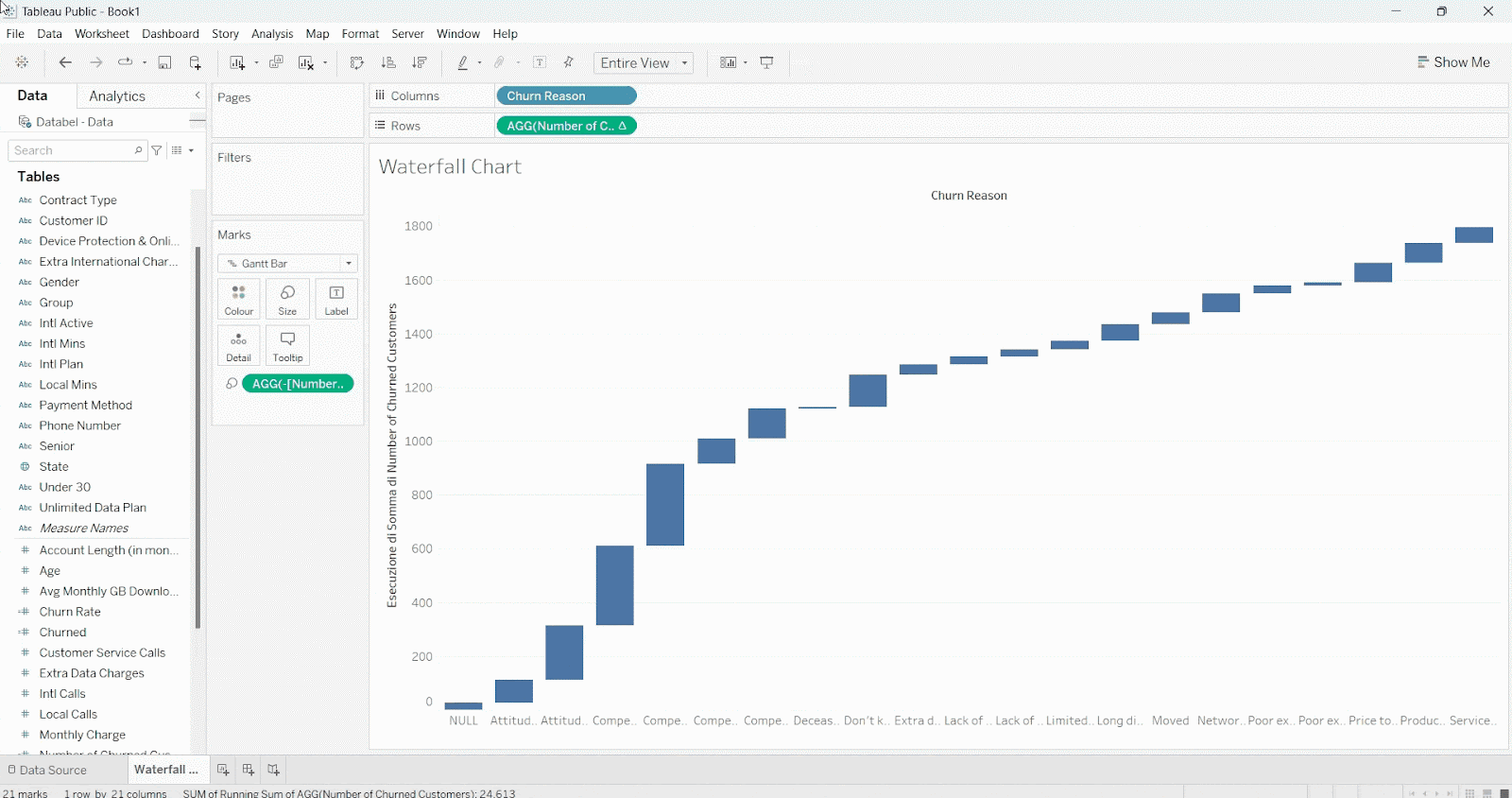
After giving our chart a final check, we see one area for improvement. We see that the bars are not adding to a cohesive total, and the bars unexpectedly overlap. Each bar is heading in the wrong direction from its starting point.
To adjust this behavior, we add a negative sign before our formula [Number of Churned Customers] in the Marks section. So the correct reading now is -[Number of Churned Customers].
Fixing our waterfall chart in Tableau. Image by Author
An important point to note: Gantt charts are typically talked about in the context of project management. Specifically, Gantt charts show a timeline of tasks completed, while waterfall charts are used to illustrate the cumulative effect of adding or subtracting values across categories.
The logical transformation of a bar chart to either a Gantt chart or a waterfall chart is much the same, however, which is why we are using the Gantt Bar button in Tableau in order to create a waterfall chart.
For more information on using Tableau to create a wide variety of advanced visualizations, including a Gantt chart, check out this course on building impressive charts in Tableau.
We have learned how to create a waterfall chart in Tableau. Let’s now take time to make the chart visually appealing for our audience. Here’s a quick checklist of things we should change:
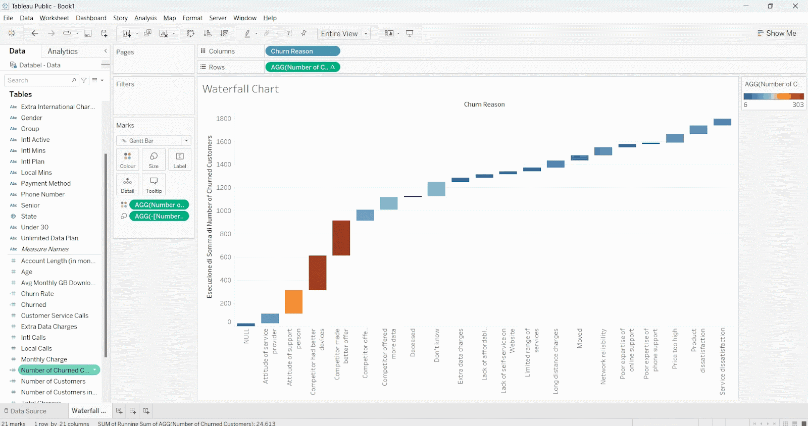
Changing the orientation of our x-axis labels is important in this case because the x-axis categories are cut off. The fix is easy: We right-click any one of the labels and then select Rotate Label. This changes all the labels at the same time.
 Changing the x-axis label orientation
After changing the orientation, we can now easily read the two main reasons for customer churn: the competitor had better devices, for one, and the competitor made better offers, for two.
Color is a great way to convey information and shouldn’t be taken for granted. Let’s use color to help us see the relative importance between categories.
We add color by dragging the Number of Churned Customers to the Color card in Marks. We then click the Color and Edit Colors buttons.
By doing so, we see that Tableau even includes options to choose color palettes. We choose the Orange-Blue Diverging palette, which seems like a good option, then specify the order of the colors as Reversed. We have now transformed our waterfall from a boring chart with a single color to something more dynamic.

Adding a color gradient. Image by Author
We see that our biggest two reasons for customer churn, that the competitor made better devices and that the competitor made better offers, are relatively equal in importance, while a third reason, the attitude of the support person, has also emerged as a unique factor.
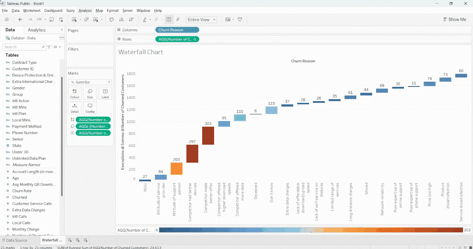
An unavoidable feature in our waterfall chart is that some of the bars are closer to the y-axis than other bars. This means that some of the grouped values will be hard to read, especially on the right-hand side.
There’s an easy fix, however: We add text totals to each group. To do this, we click and drag Number of Churned Customers to the Label card in Marks.
 Adding text labels over each section
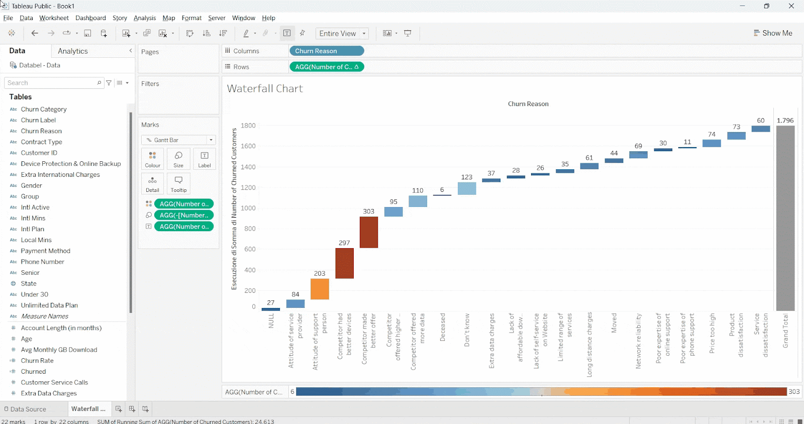
Another aesthetic choice that will help us see the full picture is adding a total column to the right-hand side. To do this, we first move the legend to the bottom of the waterfall chart. This allows us to have a bigger area. We then select Analysis followed by Totals followed by Show Row Grand Totals. Our updated chart now shows the total number of churned customers, which is 1,796.
 Adding a total column
The final touch is adding filters. This adds a layer of interactivity, which allows us to explore the graph in detail.
To add the filter, we click and drag Group to the filter shelf, select the All button, and press OK. We make the filter visible by right-clicking the Group measure and selecting the Show Filter option.
Adding a filter. Image by Author
In this tutorial, we learned how to use Tableau to create a compelling waterfall chart, which is a great chart for visualizing the cumulative impact of different factors on a particular outcome. We learned how to import data, create new fields, create a waterfall chart, and then enhance our visualizations with color palettes, new labels, and even by including interactive elements.
If you found this tutorial helpful and want to get started with Tableau, we recommend Datacamp’s course Introduction to Tableau. If you want to go deeper, check out the Data Analyst in Tableau Career Track, which provides a collection of 9 courses to master Tableau for cleaning, analyzing, and visualizing data.
Learn Tableau with DataCamp
Course
Course
Course
Tutorial
Adejumo Ridwan Suleiman
Tutorial
Eugenia Anello
Tutorial
Chloe Lubin
Tutorial
Parul Pandey
Tutorial
Islam Salahuddin
Tutorial
Tim Lu