Certification available
Course
Introduction to R
4 hr
2.7M

Data mining or machine learning techniques can oftentimes be utilized at early stages of biomedical research to analyze large datasets, for example, to aid the identification of candidate genes or predictive disease biomarkers in high-throughput sequencing datasets. However, data from clinical trials usually include “survival data” that require a quite different approach to analysis.
In this type of analysis, the time to a specific event, such as death or disease recurrence, is of interest and two (or more) groups of patients are compared with respect to this time. Three core concepts can be used to derive meaningful results from such a dataset and the aim of this tutorial is to introduce the statistical concepts, their interpretation, as well as a real-world application of these methods along with their implementation in R:
In this tutorial, you are also going to use the survival and survminer packages in R and the ovarian dataset (Edmunson J.H. et al., 1979) that comes with the survival package. You'll read more about this dataset later on in this tutorial!
Tip: check out this survminer cheat sheet
After this tutorial, you will be able to take advantage of these data to answer questions such as the following: do patients benefit from therapy regimen A as opposed to regimen B? Do patients’ age and fitness significantly influence the outcome? Is residual disease a prognostic biomarker in terms of survival?
Before you go into detail with the statistics, you might want to learn about some useful terminology:
The term "censoring" refers to incomplete data. Although different types exist, you might want to restrict yourselves to right-censored data at this point since this is the most common type of censoring in survival datasets.
For some patients, you might know that he or she was followed-up on for a certain time without an “event” occurring, but you might not know whether the patient ultimately survived or not. This can be the case if the patient was either lost to follow-up or a subject withdrew from the study. The data on this particular patient is going to be “censored” after the last time point at which you know for sure that your patient did not experience the “event” you are looking for. An event is the pre-specified endpoint of your study, for instance death or disease recurrence. Also, all patients who do not experience the “event” until the study ends will be censored at that last time point.
Basically, these are the three reason why data could be censored.
Thus, the number of censored observations is always n >= 0. All these examples are instances of “right-censoring” and one can further classify into either fixed or random type I censoring and type II censoring, but these classifications are relevant mostly from the standpoint of study-design and will not concern you in this introductory tutorial.
Something you should keep in mind is that all types of censoring are cases of non-information and censoring is never caused by the “event” that defines the endpoint of your study. That also implies that none of the censored patients in the ovarian dataset were censored because the respective patient died.
Now, how does a survival function that describes patient survival over time look like?
The Kaplan-Meier estimator, independently described by Edward Kaplan and Paul Meier and conjointly published in 1958 in the Journal of the American Statistical Association, is a non-parametric statistic that allows us to estimate the survival function.
Remember that a non-parametric statistic is not based on the assumption of an underlying probability distribution, which makes sense since survival data has a skewed distribution.
This statistic gives the probability that an individual patient will survive past a particular time t. At t = 0, the Kaplan-Meier estimator is 1 and with t going to infinity, the estimator goes to 0. In theory, with an infinitely large dataset and t measured to the second, the corresponding function of t versus survival probability is smooth. Later, you will see how it looks like in practice.
It is further based on the assumption that the probability of surviving past a certain time point t is equal to the product of the observed survival rates until time point t. More precisely, S(t) #the survival probability at time t is given by S(t) = p.1 * p.2 * … * p.t with p.1 being the proportion of all patients surviving past the first time point, p.2 being the proportion of patients surviving past the second time point, and so forth until time point t is reached.
It is important to notice that, starting with p.2 and up to p.t, you take only those patients into account who survived past the previous time point when calculating the proportions for every next time point; thus, p.2, p.3, …, p.t are proportions that are conditional on the previous proportions.
In practice, you want to organize the survival times in order of increasing duration first. This includes the censored values. You then want to calculate the proportions as described above and sum them up to derive S(t). Censored patients are omitted after the time point of censoring, so they do not influence the proportion of surviving patients. For detailed information on the method, refer to (Swinscow and Campbell, 2002).
As a last note, you can use the log-rank test to compare survival curves of two groups. The log-rank test is a statistical hypothesis test that tests the null hypothesis that survival curves of two populations do not differ. A certain probability distribution, namely a chi-squared distribution, can be used to derive a p-value. Briefly, p-values are used in statistical hypothesis testing to quantify statistical significance. A result with p < 0.05 is usually considered significant. In our case, p < 0.05 would indicate that the two treatment groups are significantly different in terms of survival.
Another useful function in the context of survival analyses is the hazard function h(t). It describes the probability of an event or its hazard h (again, survival in this case) if the subject survived up to that particular time point t. It is a bit more difficult to illustrate than the Kaplan-Meier estimator because it measures the instantaneous risk of death. Nevertheless, you need the hazard function to consider covariates when you compare survival of patient groups. Covariates, also called explanatory or independent variables in regression analysis, are variables that are possibly predictive of an outcome or that you might want to adjust for to account for interactions between variables.
Whereas the log-rank test compares two Kaplan-Meier survival curves, which might be derived from splitting a patient population into treatment subgroups, Cox proportional hazards models are derived from the underlying baseline hazard functions of the patient populations in question and an arbitrary number of dichotomized covariates. Again, it does not assume an underlying probability distribution but it assumes that the hazards of the patient groups you compare are constant over time. That is why it is called “proportional hazards model”. Later, you will see an example that illustrates these theoretical considerations.
Now, let’s try to analyze the ovarian dataset!
With these concepts at hand, you can now start to analyze an actual dataset and try to answer some of the questions above. Let’s start by loading the two packages required for the analyses and the dplyr package that comes with some useful functions for managing data frames.
# Load required packages
library(survival)
library(survminer)
library(dplyr)Tip: don't forget to use install.packages() to install any packages that might still be missing in your workspace!
The next step is to load the dataset and examine its structure. As you read in the beginning of this tutorial, you'll work with the ovarian data set. This dataset comprises a cohort of ovarian cancer patients and respective clinical information, including the time patients were tracked until they either died or were lost to follow-up (futime), whether patients were censored or not (fustat), patient age, treatment group assignment, presence of residual disease and performance status.
As you can already see, some of the variables’ names are a little cryptic, you might also want to consult the help page.
# Import the ovarian cancer dataset and have a look at it
data(ovarian)
glimpse(ovarian)
## Observations: 26
## Variables: 6
## $ futime   <dbl> 59, 115, 156, 421, 431, 448, 464, 475, 477, 563, 638,...
## $ fustat   <dbl> 1, 1, 1, 0, 1, 0, 1, 1, 0, 1, 1, 0, 0, 0, 0, 0, 0, 0,...
## $ age      <dbl> 72.3315, 74.4932, 66.4658, 53.3644, 50.3397, 56.4301,...
## $ resid.ds <dbl> 2, 2, 2, 2, 2, 1, 2, 2, 2, 1, 1, 1, 2, 2, 1, 1, 2, 1,...
## $ rx       <dbl> 1, 1, 1, 2, 1, 1, 2, 2, 1, 2, 1, 2, 2, 2, 1, 1, 1, 1,...
## $ ecog.ps  <dbl> 1, 1, 2, 1, 1, 2, 2, 2, 1, 2, 2, 1, 2, 1, 1, 2, 2, 1,...
help(ovarian)
The futime column holds the survival times. This is the response variable. fustat, on the other hand, tells you if an individual patients’ survival time is censored. Apparently, the 26 patients in this study received either one of two therapy regimens (rx) and the attending physician assessed the regression of tumors (resid.ds) and patients’ performance (according to the standardized ECOG criteria; ecog.ps) at some point.
Furthermore, you get information on patients’ age and if you want to include this as a predictive variable eventually, you have to dichotomize continuous to binary values. But what cutoff should you choose for that? Let us look at the overall distribution of age values:
# Dichotomize age and change data labels
ovarian$rx <- factor(ovarian$rx,
                     levels = c("1", "2"),
                     labels = c("A", "B"))
ovarian$resid.ds <- factor(ovarian$resid.ds,
                           levels = c("1", "2"),
                           labels = c("no", "yes"))
ovarian$ecog.ps <- factor(ovarian$ecog.ps,
                          levels = c("1", "2"),
                          labels = c("good", "bad"))

# Data seems to be bimodal
hist(ovarian$age) 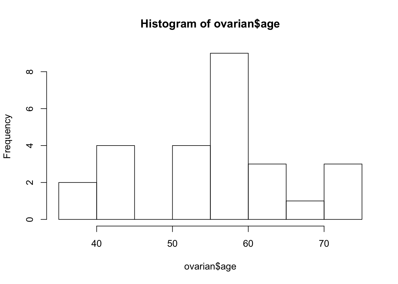
ovarian <- ovarian %>% mutate(age_group = ifelse(age >=50, "old", "young"))
ovarian$age_group <- factor(ovarian$age_group)
The obviously bi-modal distribution suggests a cutoff of 50 years. You can use the mutate function to add an additional age_group column to the data frame that will come in handy later on. Also, you should convert the future covariates into factors.
Now, you are prepared to create a survival object. That is basically a compiled version of the futime and fustat columns that can be interpreted by the survfit function. A + behind survival times indicates censored data points.
# Fit survival data using the Kaplan-Meier method
surv_object <- Surv(time = ovarian$futime, event = ovarian$fustat)
surv_object
##  [1]   59   115   156   421+  431   448+  464   475   477+  563   638
## [12]  744+  769+  770+  803+  855+ 1040+ 1106+ 1129+ 1206+ 1227+  268
## [23]  329   353   365   377+
The next step is to fit the Kaplan-Meier curves. You can easily do that by passing the surv_object to the survfit function. You can also stratify the curve depending on the treatment regimen rx that patients were assigned to. A summary() of the resulting fit1 object shows, among other things, survival times, the proportion of surviving patients at every time point, namely your p.1, p.2, ... from above, and treatment groups.
fit1 <- survfit(surv_object ~ rx, data = ovarian)
summary(fit1)
## Call: survfit(formula = surv_object ~ rx, data = ovarian)
##
##                 rx=A
##  time n.risk n.event survival std.err lower 95% CI upper 95% CI
##    59     13       1    0.923  0.0739        0.789        1.000
##   115     12       1    0.846  0.1001        0.671        1.000
##   156     11       1    0.769  0.1169        0.571        1.000
##   268     10       1    0.692  0.1280        0.482        0.995
##   329      9       1    0.615  0.1349        0.400        0.946
##   431      8       1    0.538  0.1383        0.326        0.891
##   638      5       1    0.431  0.1467        0.221        0.840
##
##                 rx=B
##  time n.risk n.event survival std.err lower 95% CI upper 95% CI
##   353     13       1    0.923  0.0739        0.789        1.000
##   365     12       1    0.846  0.1001        0.671        1.000
##   464      9       1    0.752  0.1256        0.542        1.000
##   475      8       1    0.658  0.1407        0.433        1.000
##   563      7       1    0.564  0.1488        0.336        0.946
You can examine the corresponding survival curve by passing the survival object to the ggsurvplot function. The pval = TRUE argument is very useful, because it plots the p-value of a log rank test as well!
ggsurvplot(fit1, data = ovarian, pval = TRUE)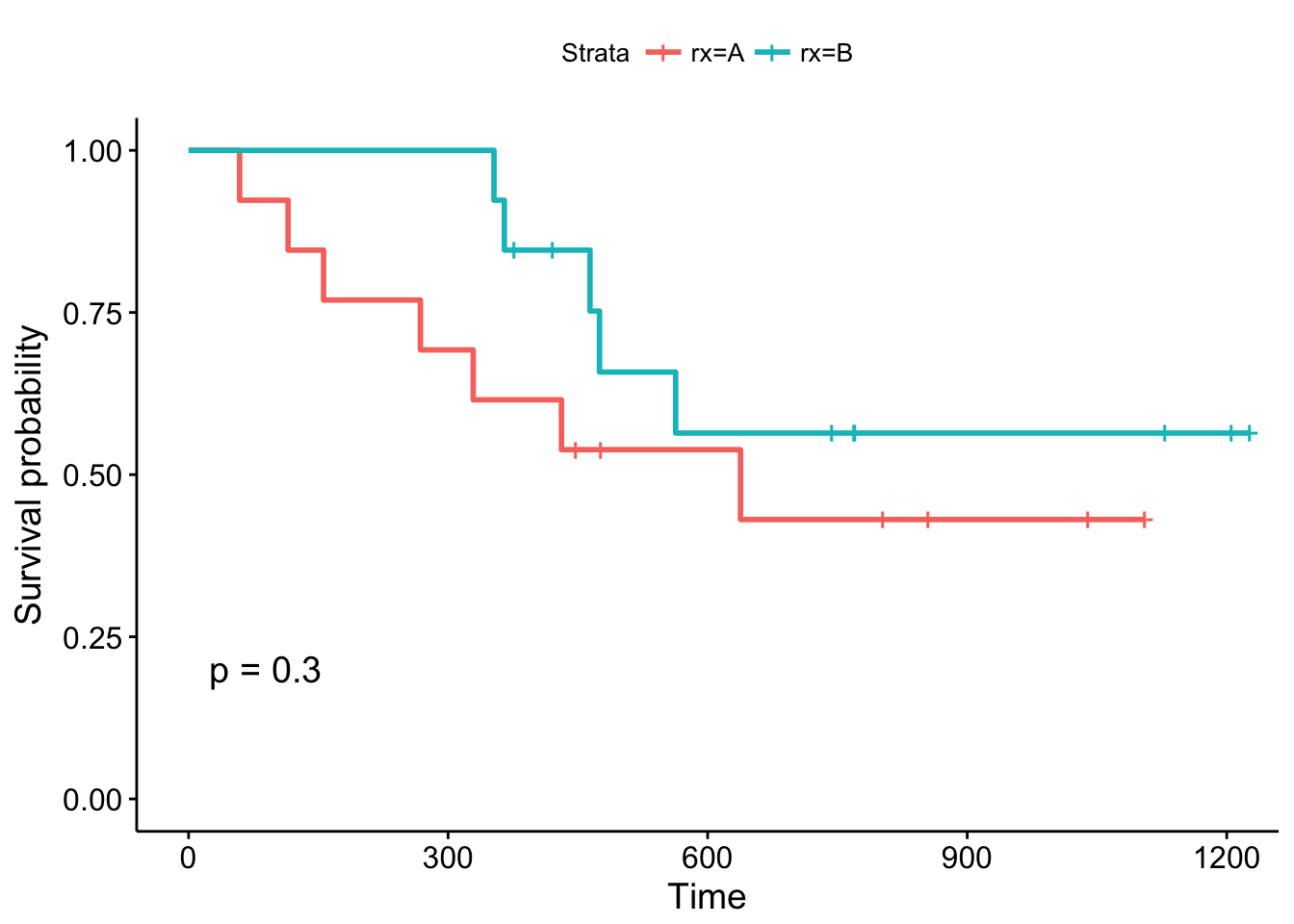
By convention, vertical lines indicate censored data, their corresponding x values the time at which censoring occurred.
The log-rank p-value of 0.3 indicates a non-significant result if you consider p < 0.05 to indicate statistical significance. In this study, none of the treatments examined were significantly superior, although patients receiving treatment B are doing better in the first month of follow-up. What about the other variables?
# Examine prdictive value of residual disease status
fit2 <- survfit(surv_object ~ resid.ds, data = ovarian)
ggsurvplot(fit2, data = ovarian, pval = TRUE)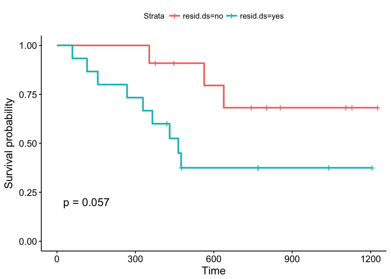
The Kaplan-Meier plots stratified according to residual disease status look a bit different: The curves diverge early and the log-rank test is almost significant. You might want to argue that a follow-up study with an increased sample size could validate these results, that is, that patients with positive residual disease status have a significantly worse prognosis compared to patients without residual disease.
But is there a more systematic way to look at the different covariates? As you might remember from one of the previous passages, Cox proportional hazards models allow you to include covariates. You can build Cox proportional hazards models using the coxph function and visualize them using the ggforest. These type of plot is called a forest plot. It shows so-called hazard ratios (HR) which are derived from the model for all covariates that we included in the formula in coxph. Briefly, an HR > 1 indicates an increased risk of death (according to the definition of h(t)) if a specific condition is met by a patient. An HR < 1, on the other hand, indicates a decreased risk. Let's look at the output of the model:
# Fit a Cox proportional hazards model
fit.coxph <- coxph(surv_object ~ rx + resid.ds + age_group + ecog.ps,
                   data = ovarian)
ggforest(fit.coxph, data = ovarian)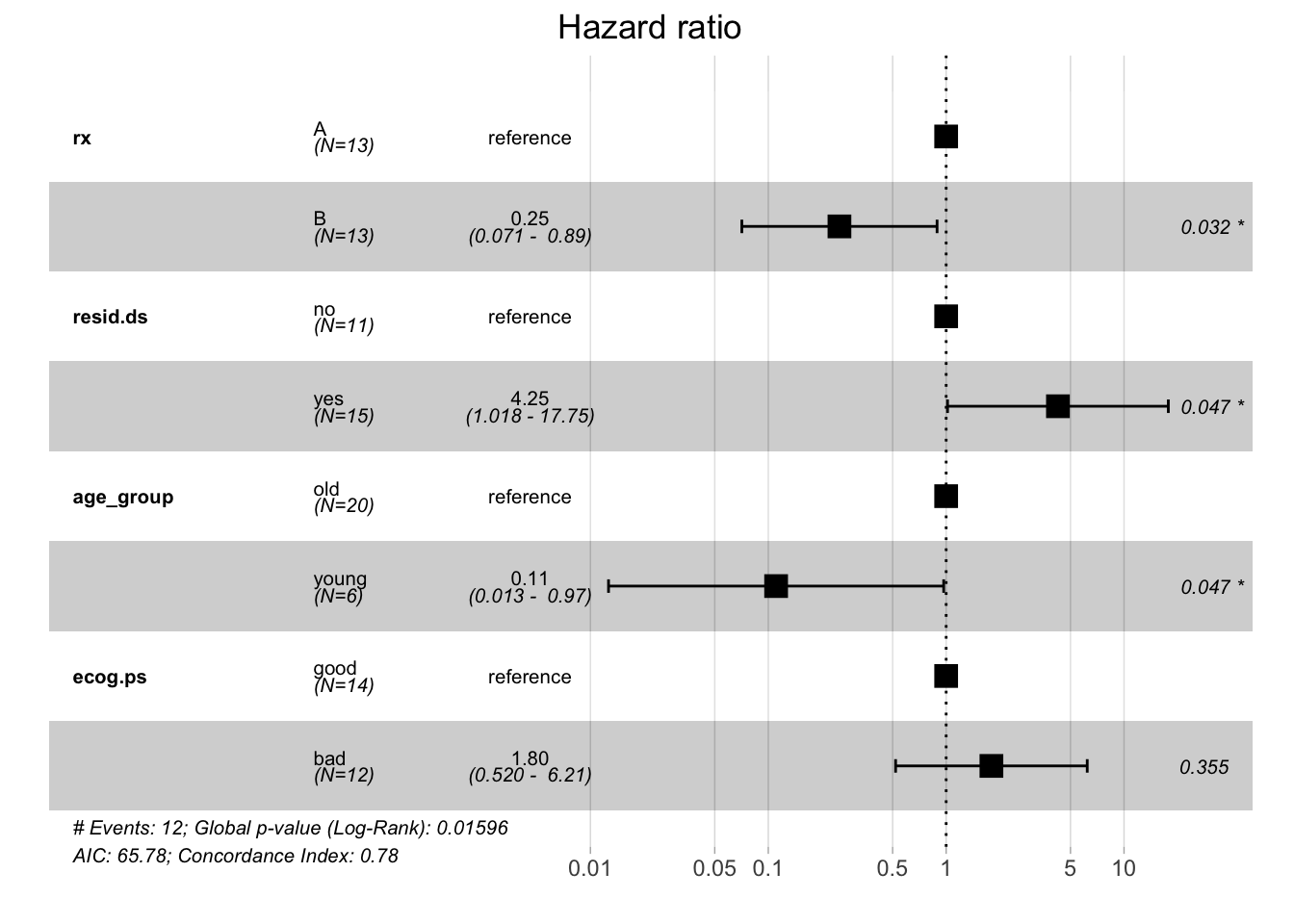
Every HR represents a relative risk of death that compares one instance of a binary feature to the other instance. For example, a hazard ratio of 0.25 for treatment groups tells you that patients who received treatment B have a reduced risk of dying compared to patients who received treatment A (which served as a reference to calculate the hazard ratio). As shown by the forest plot, the respective 95% confidence interval is 0.071 - 0.89 and this result is significant.
Using this model, you can see that the treatment group, residual disease status, and age group variables significantly influence the patients' risk of death in this study. This is quite different from what you saw with the Kaplan-Meier estimator and the log-rank test. Whereas the former estimates the survival probability, the latter calculates the risk of death and respective hazard ratios. Your analysis shows that the results that these methods yield can differ in terms of significance.
The examples above show how easy it is to implement the statistical concepts of survival analysis in R. In this introduction, you have learned how to build respective models, how to visualize them, and also some of the statistical background information that helps to understand the results of your analyses. Hopefully, you can now start to use these techniques to analyze your own datasets. Thanks for reading this tutorial!
Check out our Linear Regression in R Tutorial.
R courses
Course
Course
Course
Shawn Plummer
9 min
DataCamp Team
8 min
Matt Crabtree
8 min
Mark Graus
10 min
Elena Kosourova
12 min
Gary Alway
11 min