Track
Excel Fundamentals
16 hr
A frequency distribution, often visualized with a frequency histogram, organizes data points into specified ranges, allowing for an easy understanding of how often each value occurs. This technique is vital for identifying patterns, trends, and potential outliers, providing deeper insights into the data.
This tutorial will explore frequency distributions, their significance in data analysis, and how to create them. With Microsoft Excel, we will walk through a step-by-step guide to generating a frequency distribution for a real-world dataset and interpreting the results to gain meaningful insights.
To create a frequency distribution in Excel, use the FREQUENCY() function. The function calculates how often values occur within specified ranges, known as bins.
Follow these steps:
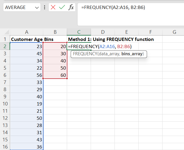
=FREQUENCY(data_array, bins_array), where data_array is the range of your data cells and bins_array is the range of your bins.=FREQUENCY(A2:A16, B2:B6).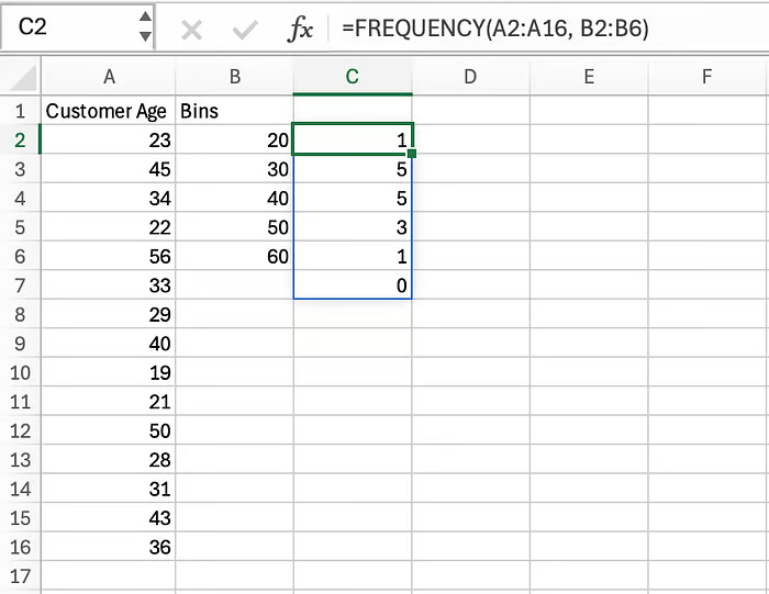 Calculating frequency distribution with
 FREQUENCY() function. Image by Author
A frequency distribution is a statistical technique that organizes data into categories or intervals. Generally, the result is a table displaying the number of observations for a provided interval of the underlying data.
Frequency distributions are helpful in several ways:
Now that we’ve understood frequency distributions and their importance, let’s dive into several methods to create them in Microsoft Excel.
Imagine you work for a cosmetic company that offers products for a wide range of age groups. Now, they are looking to specialize in a few products targeting specific age group that has more customers. To understand that, you’re tasked with analyzing the customers by age group.
To address this, they have sampled data on customer age from the customer database. The following table has been given to you:
 Customer Age dataset. Image by Author
As part of analyzing demand by customer age group, you’ve realized that calculating the frequency distribution will be a good starting point. Here are four methods to calculate the frequency distribution using Microsoft Excel.
FREQUENCY() functionThe FREQUENCY() function calculates the frequency distribution of given data and returns a list that shows the frequency of values at given intervals.
Here is the syntax of the FREQUENCY() function:
=FREQUENCY(data_array, bins_array)The function takes two parameters:
data_array: An array of or reference to a set of values for which you want to count frequencies. If data_array contains no values, FREQUENCY() returns an array of zeros.bins_array: An array of or reference to intervals into which you want to group the values in data_array. If bins_array contains no values, FREQUENCY() returns the number of elements in data_array.Both parameters are required to compute the frequency distribution. You are only given the data_array, which is Customer Age. Therefore, you are required to define the bins_array on your own.
For this use case, we can define the bins as <20, 20–30, 30–40, 40–50, 50–60 and >60. Fill out column B in your worksheet, as shown below.
 The formula for frequency distribution using
 FREQUENCY() function. Image by Author
Having prepared the data_array and bins_array, write the formula to calculate the frequency distribution in cell C2.
=FREQUENCY(A2:A16, B2:B6)The output from executing the above formula will look like the following:
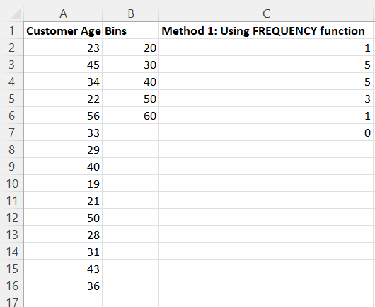
Frequency distribution using FREQUENCY() function. Image by Author
Looking at the frequency distribution above, we see:
From the frequency distribution, you understand that most customers are between 20 and 40 years old.
Pivot tables are a quick and easy way to summarize and analyze large amounts of data. Pivot tables offer features like aggregation, grouping, and slicers, to name a few.
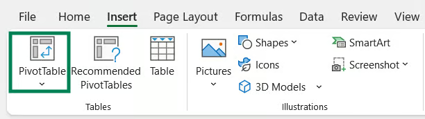
To calculate frequency distribution using Pivot Tables, click on Insert from the menu and select PivotTable.
 Insert PivotTable. Image by Author
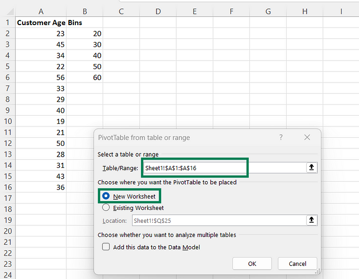
Specify the data range for which you wish to create the Pivot Table. In your case, the data range is A2:A16. Select New Worksheet to get the output in a new sheet.
After specifying the data range, press OK.
 Specifying pivot table parameters. Image by Author
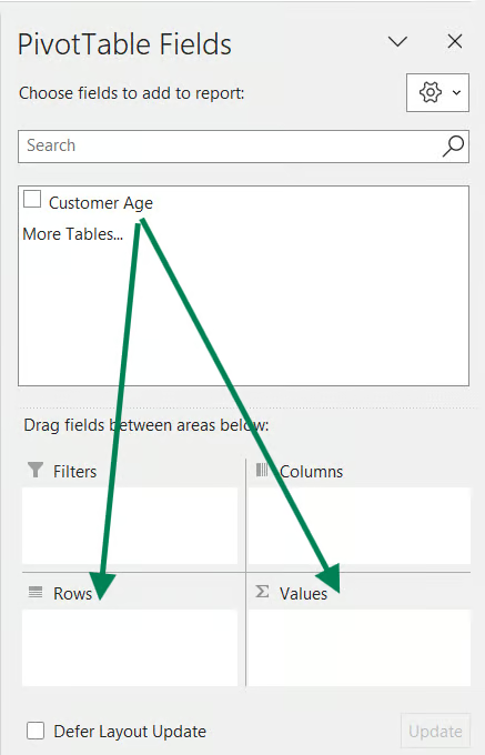
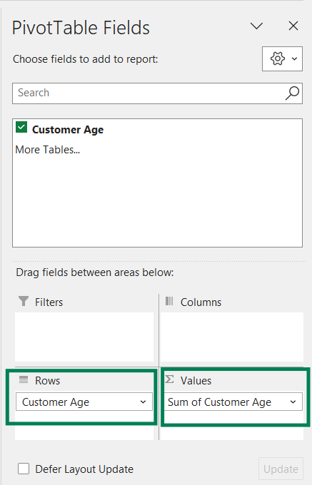
Upon clicking OK, you will see the PivotTable Fields pane on the right side of the window. To create a Pivot Table for Customer Age, drag and drop Customer Age under Rows and Values.
Customize Pivot Table. Image by Author
After you drag and drop the Customer Age field, the right pane will look like below:
Customized Pivot Table. Image by Author
The generated Pivot Table will look like this:
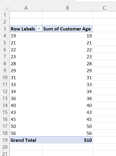
Pivot Table of Customer Age. Image by Author
If you observe the above pivot table, this is different from what you are looking for. The use case is to analyze the number of customers by age group.
We are missing two things:
Let’s fix it.
Right-click on a row value and select Group.
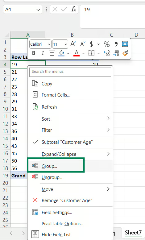
Group the row values in the pivot table. Image by Author
Fill in the grouping parameters. In our example, we chose the bins as 20, 30, 40, 50, and 60. Therefore, we start at 20 and end at 60 with an increment of 10.
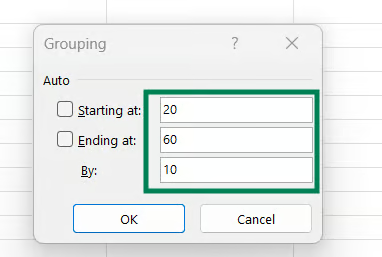
Grouping Pivot Table. Image by Author
After grouping, the output will look like:
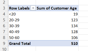
Grouped Pivot Table. Image by Author
Next, we need to change the Sum to Count. To change this, right-click on the Sum of Customer Age cell and select Value Field Settings.
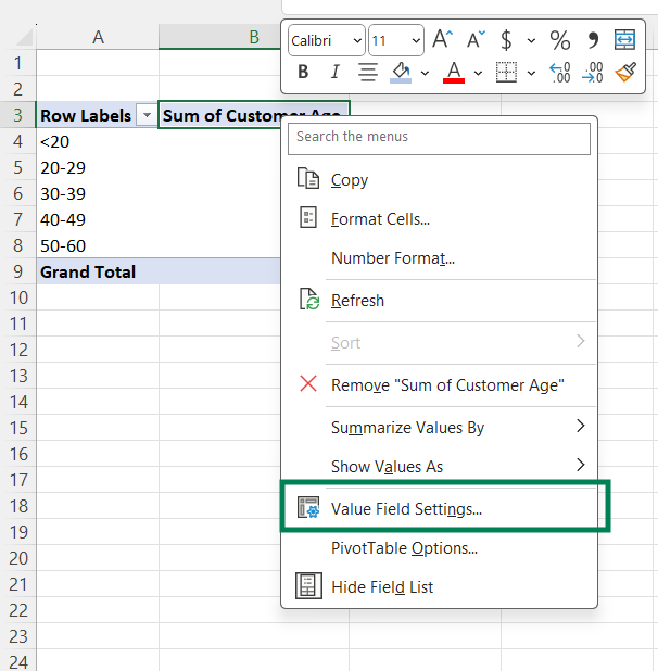 Value Field Settings in Pivot Table. Image by Author
In the popup dialog, Under Summarize Values By, change Sum to Count and press OK.
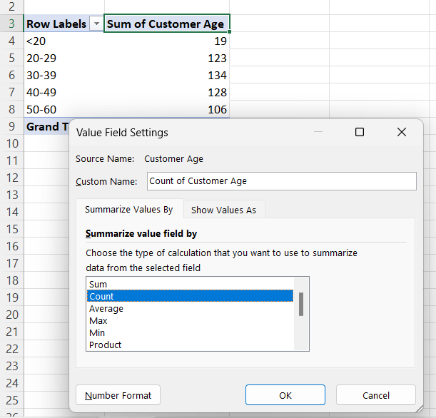 Value Field settings. Image by Author
Once you update it, the output will look like:
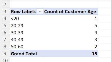
Frequency distribution using a Pivot Table. Image by Author
You were looking for this output — you’ve got the frequency distribution by Customer Age.
The Data Analysis Toolpak is an additional add-in for Microsoft Excel that helps calculate metrics commonly used in data analytics tasks.
This add-in isn’t enabled by default. Therefore, check the top right for the Data Analysis icon under the Data tab in your Excel workbook.
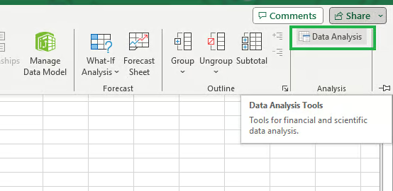 Data Analysis ToolPak in Excel. Image by Author
If you don’t see the icon as shown above, the add-in hasn't been enabled. To enable it, click on File from the menu and select Options.
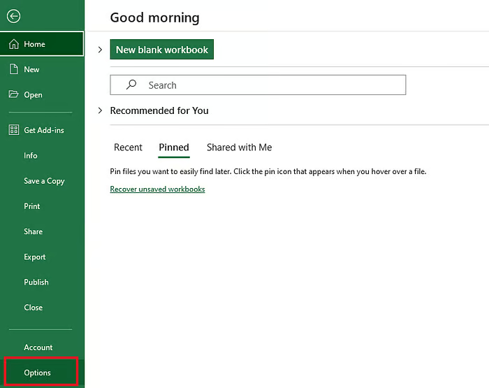 Selecting Options from the File Tab. Image by Author
Select Add-ins when the Excel Options dialog box opens.
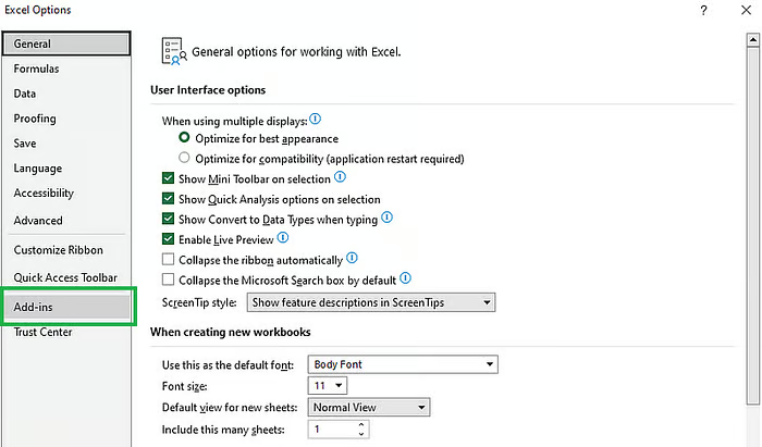 Select Add-ins from the Excel Options dialog box. Image by Author
Next, select Excel Add-ins in the Manage box at the bottom, and click Go.
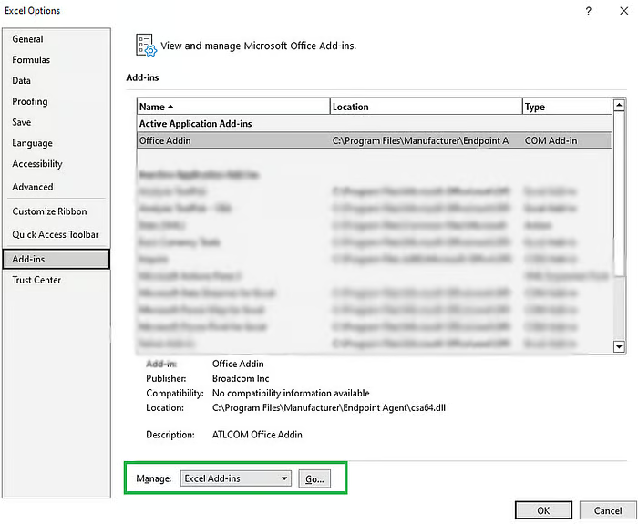 Managing Excel add-ins. Image by Author
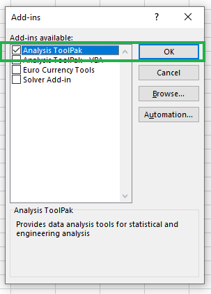
Check Analysis ToolPak once the Add-Ins dialog box opens and click OK.
Enabling Data Analysis ToolPak. Image by Author
The Data Analysis icon will be visible under the Data tab now, and you need not repeat this process, as enabling the add-in is a one-time task.
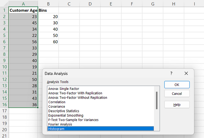
Select the data range, including the column header, to calculate the frequency distribution. Click on the Data Analysis icon. A dialog box will pop up. Choose the Histogram from it and click OK.
 Invoking the Data Analysis Toolpak add-in. Image by Author
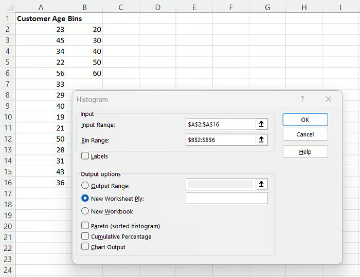
You will be prompted with a dialog box, as shown below.
 Customize histogram parameters. Image by Author
Fill in the Input range with the Customer Age data range and Bin Range with Bins.
A2:A16.B2:B6.You will see the frequency distribution in a new worksheet like the one below.
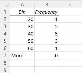
Frequency distribution using Data Analysis Toolpak. Image by Author
Voila! You have the frequency distribution by age group created using the Data Analysis ToolPak.
The COUNTIF() function counts the number of times a single criterion is met. The COUNTIFS() function counts the number of cells that meet multiple criteria.
To calculate the frequency for each age group, enter the below formulas in cells D2 to D7, respectively.
# In cell D2
=COUNTIF(A2:A16, "<=20")
# In cell D3
=COUNTIFS(A2:A16, ">20", A2:A16, "<=30")
# In cell D4
=COUNTIFS(A2:A16, ">30", A2:A16, "<=40")
# In cell D5
=COUNTIFS(A2:A16, ">40", A2:A16, "<=50")
# In cell D6
=COUNTIFS(A2:A16, ">50", A2:A16, "<=60")
# In cell D7
=COUNTIF(A2:A16, ">60")
Here’s an example of how to add the formula to the cells. Once you calculate all of them, the output will look like:
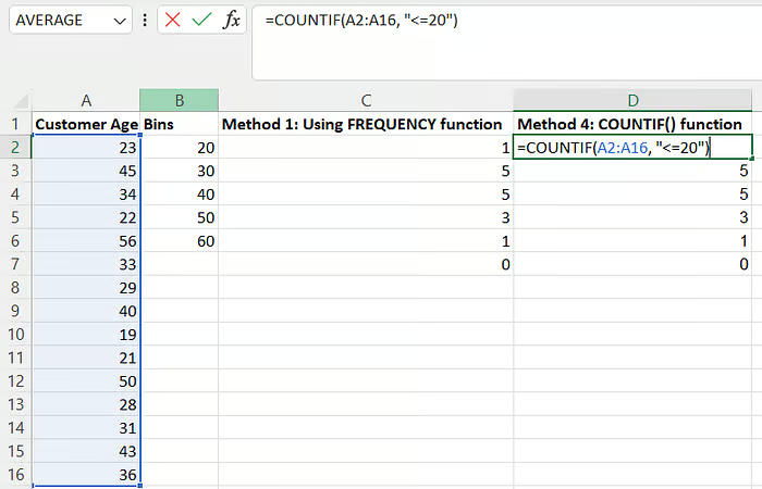 Calculate frequency distribution using the
 COUNTIF() function. Image by Author
Compared to other methods discussed, a limitation of using COUNTIF() is that it requires predefined bin ranges within the equation.
The most common method to create the frequency distribution table is by using the FREQUENCY() function.
However, feel free to use whichever method you find comfortable. For example, using the Data Analysis Toolpak might be a better fit if you’re also calculating other statistical measures such as skewness, ANOVA, or correlation matrix as part of the analysis.
In this tutorial, we learned the importance of frequency distribution and how to calculate it using Microsoft Excel. By working through a real-world example, we learned to use the FREQUENCY() function and interpret the resulting distribution to gain insights into our data. We explored three alternative ways to calculate the frequency distribution.
The learning doesn’t have to stop here, and we encourage you to continue learning and expanding your Excel skills. Consider taking the Excel Fundamentals track to build your foundation with Excel. The courses Data Preparation in Excel and Data Visualization in Excel can assist you in expanding your knowledge of these topics. Have a look at the Data Manipulation in Excel Cheat Sheet, which can serve as a quick reference.
Happy learning!!!
Learn with DataCamp
Track
Course
Course
blog
Arunn Thevapalan
8 min
Tutorial
Arunn Thevapalan
Tutorial
Laiba Siddiqui
Tutorial
Kevin Babitz
Tutorial
Vinod Chugani
Tutorial
Arunn Thevapalan