
Course
Inference for Linear Regression in R
4 hr
16K
Linear regression is one of the simplest machine-learning techniques. It involves predicting the value of a dependent variable based on one or more independent variables.
For instance, linear regression can be applied to predict house prices based on house size or predict a person’s weight given their height. Linear regression models are primarily categorized into two types: simple and multiple linear regression.
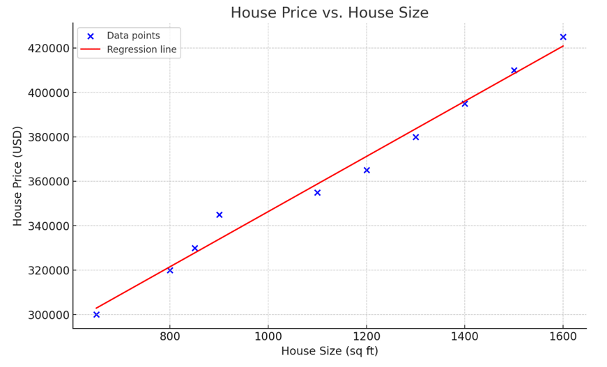
Image by OpenAI
The above graph represents simple linear regression, modeling the relationship between house size (independent variable) and house price (dependent variable). As observed in the visualization, the larger the house, the more expensive it is.
The equation of the regression line is:
y = mx + c + ⍷
If the above formula looks familiar, it is because you’ve probably learned in school that y = mx + c is the equation of a straight line. In this equation:
⍷ represents the residual or error term. This is the difference between the actual value and the value predicted by the regression value. distinguishes a regression line from a purely deterministic straight line, making the relationship between x and y not perfectly predictable.
For a more extensive guide on the topic, read our article explaining the essentials of linear regression.
Here are some factors that make Excel an effective tool for performing linear regression:
As of 2024, Excel is used by over 731,000 companies in the United States and countless more worldwide, as reported by Statista. Executives across all organizational levels use Excel for data management and reporting purposes.
By creating predictive models like linear regression in Excel, companies can consolidate their reporting and predictive modeling activities within a single platform. This allows organizations to streamline workflows instead of having to constantly switch between programming environments and Excel spreadsheets.
If you are a beginner in the data industry, the mere thought of building a predictive model might seem intimidating due to the coding involved. Excel simplifies this process, allowing you to work in an interface you’re already familiar with. With Excel, constructing a linear regression model becomes a simple process, achievable in just a few clicks.
Excel offers strong visualization capabilities, allowing you to graph the relationship between different variables to better understand them. Additionally, it simplifies report creation, ensuring that visualizations can be easily embedded into PowerPoint presentations for effective communication with stakeholders.
Before diving into this tutorial, download the dataset available at this GitHub repository. This dataset has been specifically created by OpenAI for educational purposes. Having a grasp of basic spreadsheet operations, such as entering data, applying simple formulas, and navigating through worksheets, will enhance your ability to follow this tutorial.
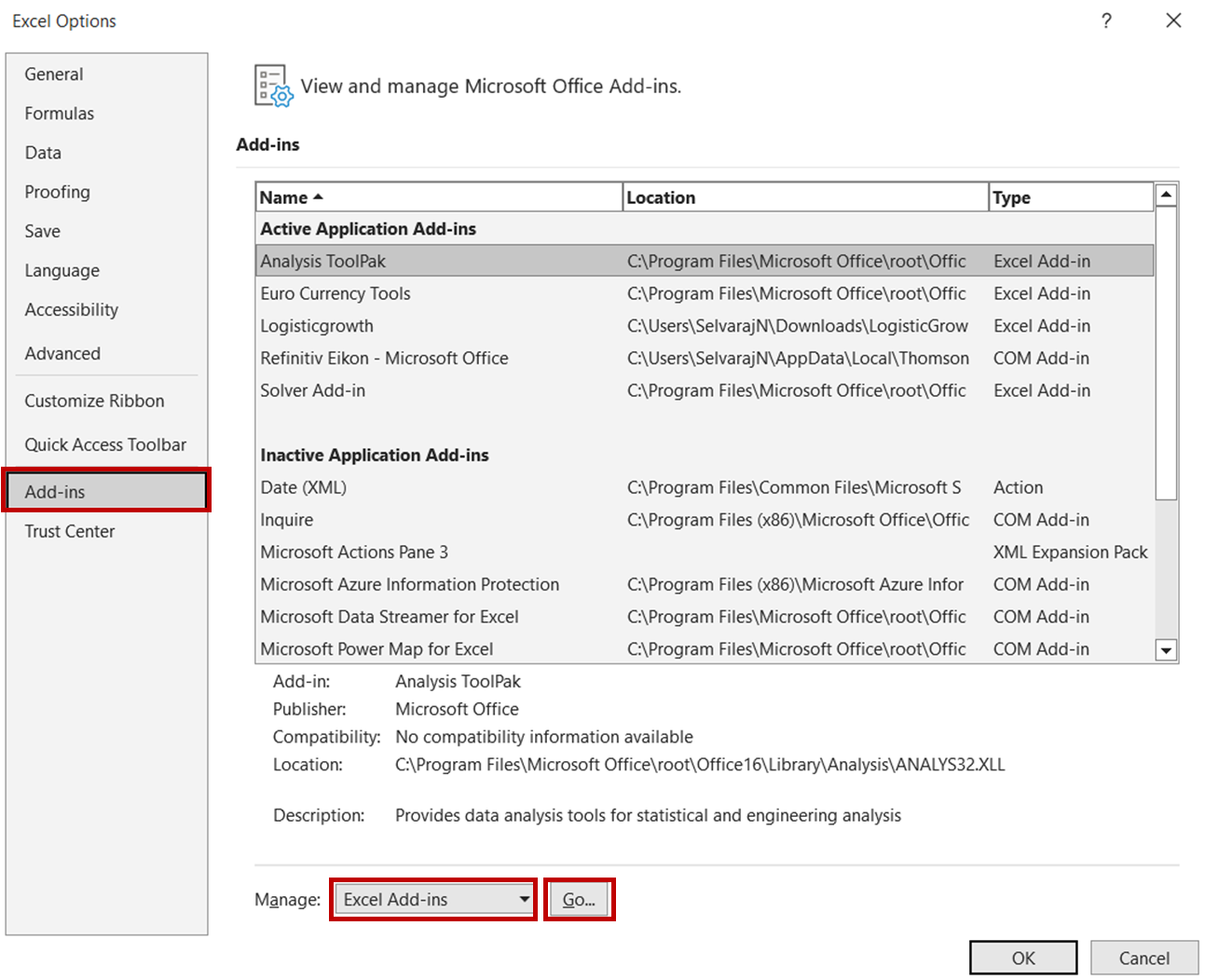
First, we need to enable the Data Analysis ToolPak in Excel. This is an Excel add-in program that provides a variety of data analysis tools, including the one we’ll be using for linear regression.
To accomplish this, first, open the Excel file and navigate to File -> Options. In the Options dialog box, select Add-ins -> Excel Add-ins and click Go:
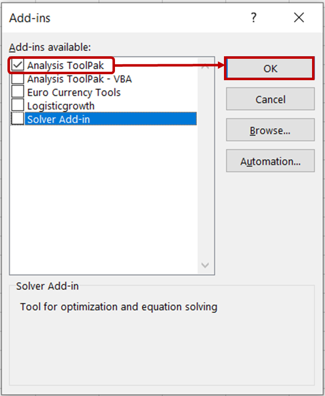
In the Add-ins dialog box, check the Analysis ToolPak option and click OK.
You should now see the Data Analysis tools in the Data tab.
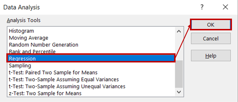
Now that we’ve enabled the Data Analysis ToolPak, we can proceed to perform linear regression on the dataset. Open the ice cream sales dataset and navigate to the Data tab. In the Analysis group, click on Data Analysis.

Then, select Regression from the list of analysis tools and click OK.
In the regression dialog box, for the Input Y Range, select the column containing ice cream sales data. For the Input X range, select the columns containing temperature and price data. Ensure that the Labels box is checked, as this will help Excel recognize the headers and treat the remaining rows as numeric data. In the Output options section, select New Worksheet Ply to see the results displayed in a new worksheet.
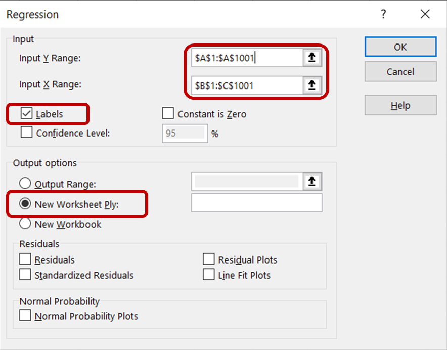
Then, click OK to run the regression analysis on the dataset.
After performing the regression, you should see a new worksheet automatically appear within the Excel file, showcasing an array of results tables that look like this:
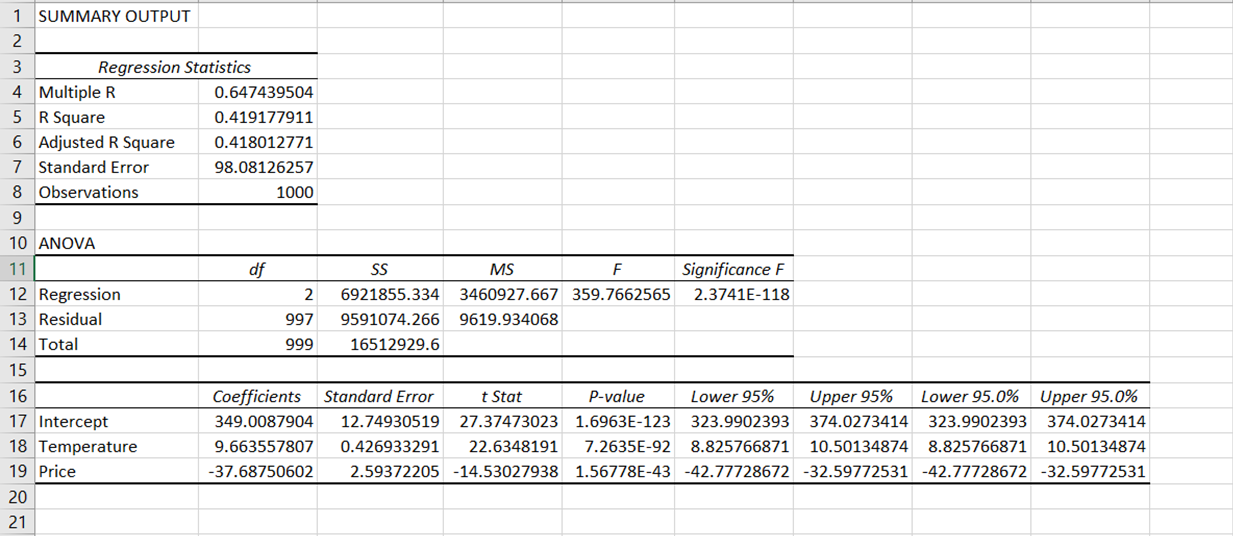
The results of the regression output have been broken down into various components: regression statistics, ANOVA, coefficients, standard error, t Stat, P-value, and confidence interval.
Let’s examine each of these components in greater detail:
Excel reports the following summary statistics as a result of the regression analysis:
Multiple R
This is a correlation coefficient that measures the strength and direction of a linear relationship between variables. It ranges from -1 to 1, with values near -1 or 1 indicating a strong relationship and values near 0 suggesting no correlation.
In our analysis, the correlation coefficient is approximately 0.65, showing a moderate positive correlation between our dependent variable (ice cream sales) and independent variables (price and temperature).
R Square
R2 is a statistical measure that tells us how well the data fits the regression model. It is the square of the correlation coefficient, Multiple R, and represents the proportion of variance in the dependent variable that can be explained by independent variables.
R2 ranges from 0 to 1, with values closer to 1 suggesting a better model fit. Our R2 is approximately 0.419, which means that around 41.9% of the variance in ice cream sales can be explained by the model.
Adjusted R Square
This is the R-squared value adjusted for the number of predictors in the model. It is generally a better measure when comparing models with different numbers of predictors. In our case, the adjusted R2 is 0.418. This is very similar to our R2, suggesting that the independent variables we’ve included (temperature and price) are relevant to the model and haven’t introduced a large penalty.
Standard Error
The standard error measures the average distance that the observed values fall from the regression line. A smaller standard error is better since it means that the regression line is a closer fit to the data.
In our case, the standard error is approximately 98.05, indicating that the actual ice cream sales values deviate from the predicted ones by about 98.05 units.
Observations
This refers to the total number of data points (rows) analyzed in the dataset, excluding any headers.
ANOVA stands for Analysis of Variance. It is a statistical technique that provides information about the level of variability within a regression model through:
Degrees of Freedom (df)
This represents the number of values in the final calculation that are free to vary. In the context of ANOVA, “Regression” df refers to the number of independent variables in the model, which is 2. “Residual” df is calculated by subtracting the number of independent variables and 1 from the total number of observations. In our case, this is 997.
Sum of Squares (SS)
This quantifies variation. “Regression SS” measures the variation in the dependent variable that can be explained by the model. “Residual SS” represents the unexplained variation.
Mean Square (MS)
This is derived by dividing the Sum of Squares (SS) by the Degrees of Freedom (df).
F-statistic (F)
This statistic determines the model’s overall significance. A higher F-value indicates that the model is a better fit for the data.
Significance F
This is the P-value associated with the F-statistic. A very small p-value (less than 0.05) indicates that your model provides a better fit to the data than a model with no independent variables. In our case, the Significance F value is lower than 0.05, indicating that the model fits the data well.
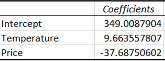
Coefficients represent the estimated amount of change in the dependent variable for a one-unit change in the independent variable.
The coefficient for temperature indicates that with every one-unit increase in temperature, sales increase by around 9.66 units. Conversely, the coefficient for price indicates that sales decrease by approximately 37.69 units with a one-unit increase in price.
The standard error measures the average distance between the observed values and the regression line. A lower standard error indicates a better model.
The t-statistic is the coefficient divided by its standard error. A larger t-statistic indicates that the coefficient is different from zero, implying that it has a greater impact on the dependent variable.
P-values tell us the probability of observing a t-statistic as extreme as the one observed under the assumption that the null hypothesis is true (i.e., the coefficient for an independent variable is 0).
In simple terms, the larger the t-statistic and the smaller the P-value, the greater the evidence against the null hypothesis, supporting the conclusion that the independent variables (price and temperature) have a statistically significant impact on the dependent variable (ice cream sales).
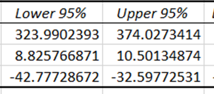
Confidence intervals provide the lower and upper limits within which the true coefficients of the independent variables are expected to fall, with a 95% confidence level. Since the confidence intervals for price and temperature are different from zero, these coefficients have a statistically significant impact in predicting ice cream sales.
Visualizing the relationship between two variables can greatly improve your understanding of the dataset. While Excel’s Analysis ToolPak provides detailed summary statistics, a graphical representation can instantly show you the strength and direction of a relationship between variables.
Creating a scatter plot with a trend line is an effective way to visualize this relationship, and it can be done in less than five minutes. This visualization technique allows you to see at a glance how one variable impacts another.
Here’s how to visualize the relationship between “Ice Cream Sales” and “Temperature”:
First, highlight the cells containing the “Ice Cream Sales” and “Temperature” variables. Then, navigate to the “Insert” tab and click on the “Scatter” chart icon:
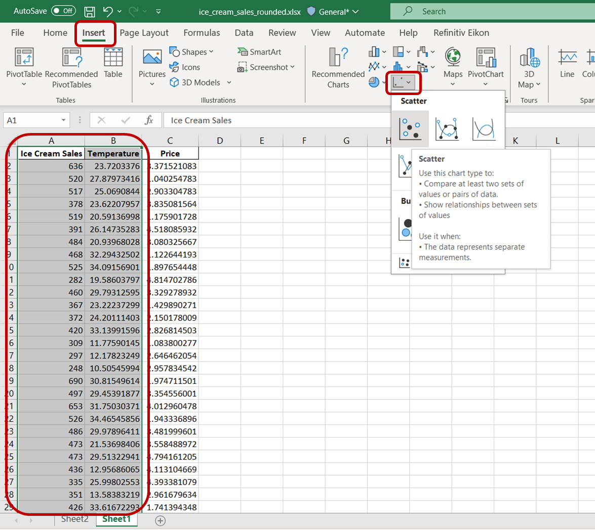
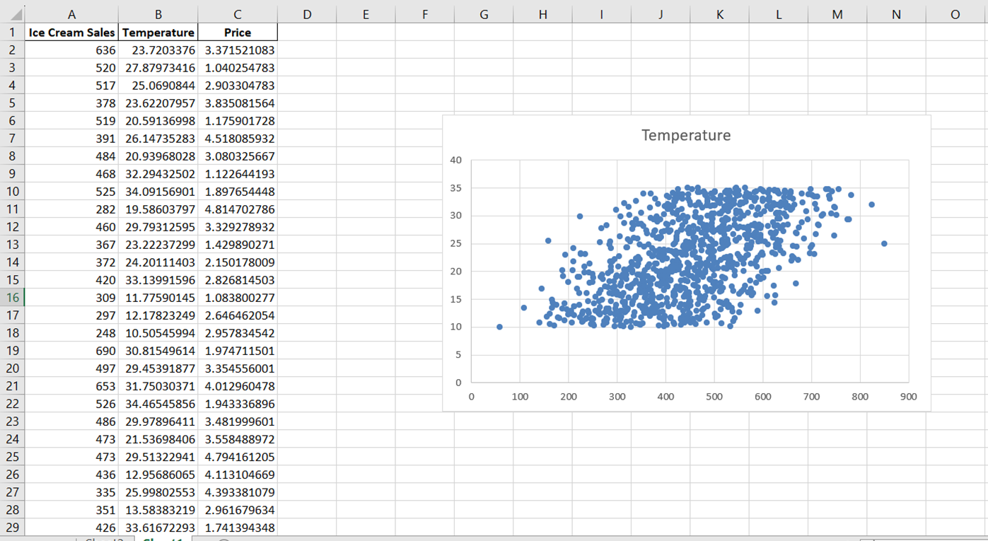
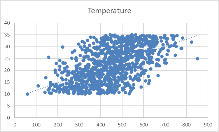
You will see a plain scatter plot that looks like this:
Let’s now rename the chart to accurately describe the relationship we’re visualizing. Simply click on the chart title and change it to “Relationship between ice cream sales and temperature.”
Next, to change the x-axis label, navigate to “Chart Design.” In the “Add Chart Element” drop-down, select “Axis Titles” -> “Primary Horizontal”:
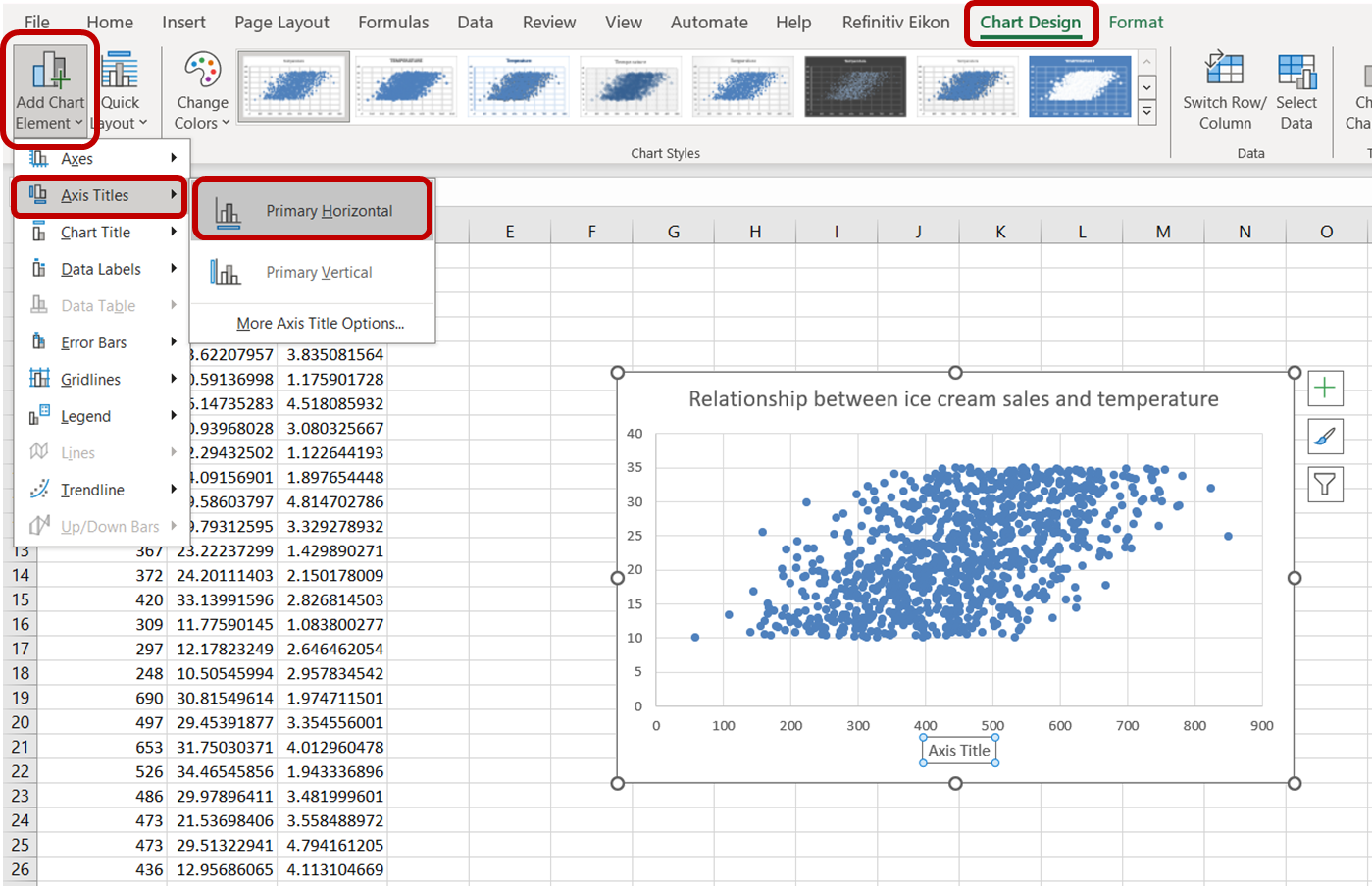
Click on the default axis title that appears and type “Ice Cream Sales” to accurately label the axis. Do the same for the y-axis by selecting “Primary Vertical” and replacing the axis title with “Temperature:”
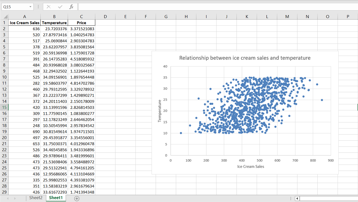
Notice that while the scatter plot reveals a general direction in the relationship between temperature and ice cream sales, the data points appear to be broadly dispersed. To better summarize this relationship, including its overall direction and slope, let’s incorporate a trendline or a line of best fit.
To add a trendline to this chart, simply click on any data point on this scatterplot. This action will select all the data points on the chart. Then, right-click on the selected data points. On the menu that appears, choose “Add Trendline:”
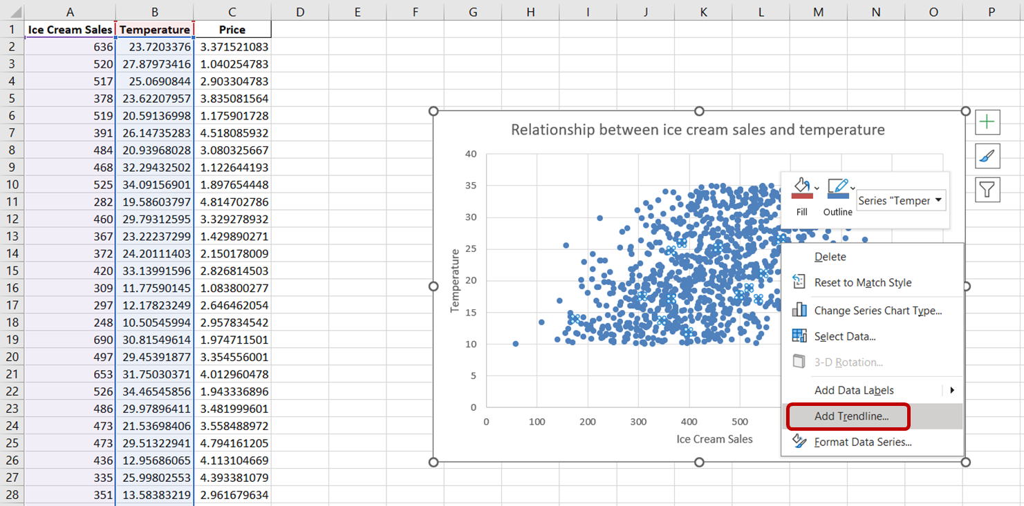
You should see a dotted line appear on the chart, illustrating the general direction of the relationship between the variables:
The trendline appears faint and subtle. Let’s adjust its formatting for better visibility.
First, click on the trendline to select it. The “Format Trendline” task pane will appear on the right side of your Excel window. In this task pane, select the “Fill & Line” option. Then, increase the width of the trendline to 3pt and change its color to red:
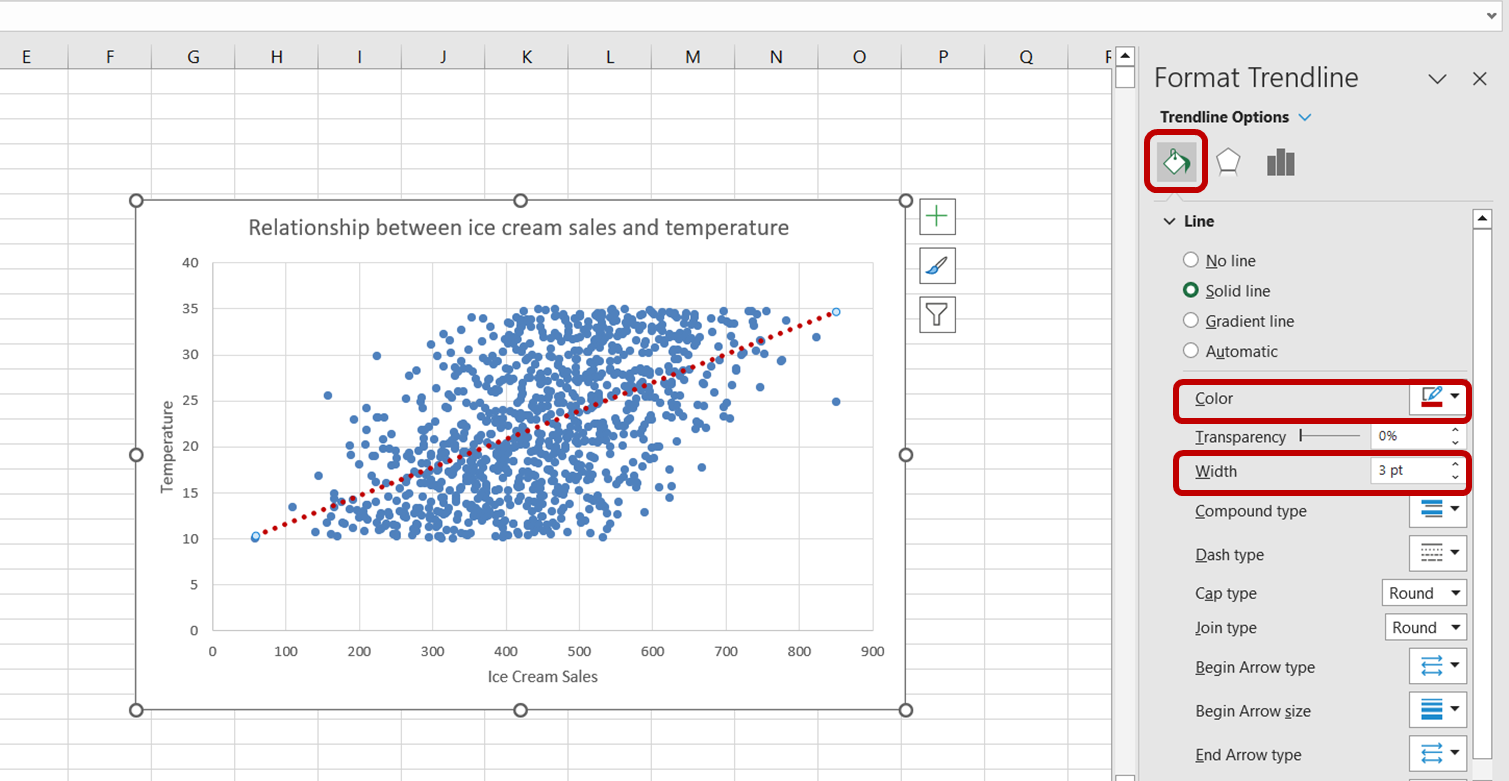
We have now successfully created a visualization to better understand the relationship between ice cream sales and temperature.
Just by looking at the above chart, we can tell that there is a positive relationship between temperature and ice cream sales. As temperature increases, it appears as though ice cream sales increase as well, indicating that temperature is a significant predictor of ice cream sales.
Note that this observation is similar to the one we derived from the results of the regression analysis in the previous section.
You’ve now gained a solid grasp of how to perform linear regression in Excel, interpret various statistical measures to evaluate a model’s fit, and visualize regression analysis using scatter plots and trendlines.
But the journey doesn’t stop here.
Believe it or not, we have only scratched the surface of predictive modeling, and there is so much more to learn. Here are some potential next steps to deepen your understanding of the subject.
Practice the concepts you’ve learned in this article to ensure you don’t forget them. For example, take the dataset used in this tutorial and create a scatter plot to illustrate the relationship between ice cream sales and prices.
You can even take this one step further by learning how to display the regression equation on the trend line.
As we’ve established earlier in this article, Excel’s extensive use across numerous organizations places it in high demand. Having a strong grasp of Excel can significantly improve your chances of employment in various industries due to its widespread application.
If you encountered difficulties when following this tutorial, or if you’re not yet comfortable with Excel’s formulas, consider enrolling in our Excel Fundamentals learning track. This course will introduce you to various data visualization techniques, pivot tables, and logical functions such as COUNTIFs and Nested IFs, paving the way toward Excel mastery.
Gain the skills to maximize Excel—no experience required.
Start Your Regression Journey Today!
Course
Course
Tutorial
Josef Waples
Tutorial
Josef Waples
Tutorial
Jess Ahmet
Tutorial
Zoumana Keita
Tutorial
Arunn Thevapalan
Tutorial
Eladio Montero Porras