Course
Intermediate Data Visualization with Seaborn
4 hr
75K
Seaborn is one of the go-to Python libraries for statisticaldata visualization. Built on Matplotlib, it generates polished charts with less code, integrates with pandas DataFrames out of the box, and handles common statistical plots—histograms, box plots, heatmaps, regression fits—through a consistent API.
In this tutorial, I’ll walk through Seaborn’s core plot types, show how to customize them, and compare Seaborn with other Python visualization libraries like Matplotlib and Plotly. All code examples use Seaborn 0.13+ and pandas 2.0+.
Seaborn is a Python statistical visualization library built on Matplotlib—install it with pip install seaborn
It works directly with pandas DataFrames: pass column names as x, y, and hue arguments
Key plot types: scatterplot(), lineplot(), barplot(), histplot(), boxplot(), heatmap(), pairplot()
Figure-level functions (relplot(), displot(), catplot()) create multi-panel grids in one call
Customize appearance with set_theme() and built-in color palettes
Seaborn is a Python data visualization library built on top of Matplotlib. It works directly with pandas DataFrames, so you pass column names as arguments instead of raw arrays. The library covers the most common statistical chart types: scatter plots, line plots, bar plots, histograms, box plots, heatmaps, and more.
Seaborn organizes its API into three levels:
Figure-level functions (relplot(), displot(), catplot()) create entire figure grids and handle faceting automatically
Axes-level functions (scatterplot(), histplot(), boxplot(), etc.) draw onto a single Matplotlib axes
Utility functions (heatmap(), pairplot(), jointplot()) for specialized multi-panel layouts
You can learn more about Seaborn with our Introduction to Data Visualization with Seaborn course.
Seaborn ships with built-in themes and color palettes you can apply with a single set_theme() call. It also includes statistical estimation—confidence intervals on bar plots, regression fits, kernel density estimates—so you can go from raw data to a publication-ready figure with minimal code.
Python's two most widely used data visualization libraries are Matplotlib and Seaborn. While both libraries are designed to create high-quality graphics and visualizations, they have several key differences that make them better suited for different use cases.
Matplotlib gives you full control over every element of a figure (axes, ticks, legends, annotations), but that control means more code for every chart. Seaborn trades some of that granularity for speed: a single function call with a DataFrame produces a styled statistical plot.
| Feature | Matplotlib | Seaborn |
|---|---|---|
| Abstraction level | Low-level (fine-grained control) | High-level (statistical defaults) |
| Default styling | Minimal—requires manual theming | Publication-ready themes built in |
| DataFrame integration | Accepts arrays; DataFrame support added later | Built around pandas DataFrames |
| Statistical features | None built-in | Confidence intervals, regression, KDE |
| Multi-panel layouts | Manual with subplots() |
Automatic with FacetGrid, relplot() |
| Best for | Custom, non-standard figures | Exploratory data analysis, standard statistical charts |
In practice, you use both together. Seaborn creates the plot, then you call Matplotlib functions to fine-tune labels, limits, or annotations—as you’ll see in the examples below.
You can explore Matplotlib in more detail with our Introduction to Plotting with Matplotlib in Python tutorial.
Seaborn requires Python 3.9+ (as of version 0.13) and depends on Matplotlib, pandas, and NumPy. Install it with pip or conda:
# install seaborn with pip
pip install seaborn
When you use pip, Seaborn and its required dependencies will be installed. If you want to access additional and optional features, you can also include optional dependencies in pip install. For example:
pip install seaborn[stats]
Or with conda:
# install seaborn with conda
conda install seaborn
Seaborn provides several built-in datasets that we can use for data visualization and statistical analysis. These datasets are stored in pandas dataframes, making them easy to use with Seaborn's plotting functions.
One of the most common datasets that’s also used in all the official examples of Seaborn is called `tips dataset`; it contains information about tips given in restaurants. Here's an example of loading and visualizing the Tips dataset in Seaborn:
import seaborn as sns

tips = sns.load_dataset("tips")
sns.histplot(data=tips, x="total_bill")Output:
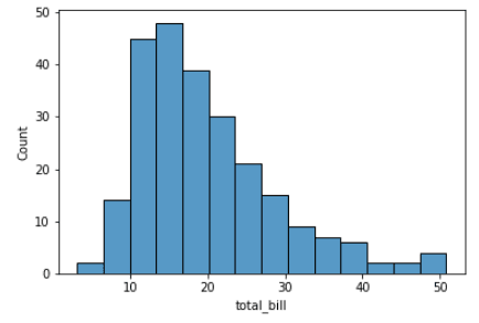
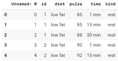
If you don’t understand this plot yet - no worries. This is called a histogram. We will explain more in detail about histograms later in this tutorial. For now, the takeaway is that Seaborn comes with a lot of sample datasets as pandas DataFrames that are easy to use and practice your visualization skills. Here is another example of loading the `exercise` dataset.
import seaborn as sns

# Load the exercise dataset
exercise = sns.load_dataset("exercise")

# check the head
exercise.head()Output:
Seaborn provides a range of plot types for different analytical needs. Any visualization generally falls into one of three categories:
Here are some of the most commonly used plot types in Seaborn:
We will now see examples and detailed explanations for each of these in the next section of this tutorial.
One of the most important concepts in Seaborn is the distinction between figure-level and axes-level functions. Understanding this will save you debugging time.
Axes-level functions (like scatterplot(), histplot(), boxplot()) draw onto a single Matplotlib axes. You can pass an ax argument to control where the plot goes:
import seaborn as sns
import matplotlib.pyplot as plt

fig, axes = plt.subplots(1, 2, figsize=(12, 5))

tips = sns.load_dataset("tips")
sns.histplot(data=tips, x="total_bill", ax=axes[0])
sns.boxplot(data=tips, x="day", y="total_bill", ax=axes[1])

plt.tight_layout()
plt.show()
Figure-level functions (relplot(), displot(), catplot()) create their own figure and can automatically split data into multiple panels using col and row parameters:
import seaborn as sns

tips = sns.load_dataset("tips")
sns.displot(data=tips, x="total_bill", col="time", kde=True)
Figure-level functions return a FacetGrid object instead of an axes, so you set titles and labels differently: use g.set_axis_labels() and g.set_titles() instead of plt.xlabel().
Let's see Seaborn in action with a few examples of different plot types.
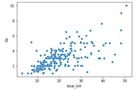
Scatter plots are used to visualize the relationship between two continuous variables. Each point on the plot represents a single data point, and the position of the point on the x and y-axis represents the values of the two variables.
The plot can be customized with different colors and markers to help distinguish different groups of data points. In Seaborn, scatter plots can be created using the scatterplot() function.
import seaborn as sns

tips = sns.load_dataset("tips")
sns.scatterplot(x="total_bill", y="tip", data=tips)Output:
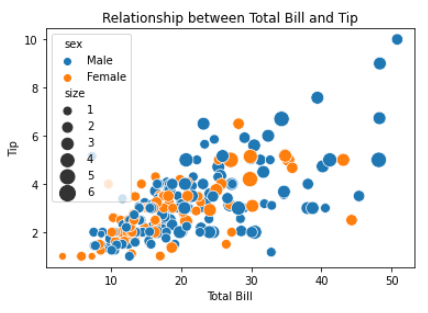
This simple plot can be improved by customizing the `hue` and `size` parameters of the plot. Here’s how:
import seaborn as sns
import matplotlib.pyplot as plt

tips = sns.load_dataset("tips")

# customize the scatter plot
sns.scatterplot(x="total_bill", y="tip", hue="sex", size="size", sizes=(50, 200), data=tips)

# add labels and title
plt.xlabel("Total Bill")
plt.ylabel("Tip")
plt.title("Relationship between Total Bill and Tip")

# display the plot
plt.show()Output:
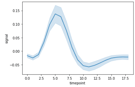
Line plots are used to visualize trends in data over time or other continuous variables. In a line plot, each data point is connected by a line, creating a smooth curve.In Seaborn, line plots can be created using the lineplot() function. You can dive deeper in our Seaborn line plot tutorial.
import seaborn as sns

fmri = sns.load_dataset("fmri")
sns.lineplot(x="timepoint", y="signal", data=fmri)Output:
We can very easily customize this by using `event` and `region` columns from the dataset.
import seaborn as sns
import matplotlib.pyplot as plt

fmri = sns.load_dataset("fmri")

# customize the line plot
sns.lineplot(x="timepoint", y="signal", hue="event", style="region", markers=True, dashes=False, data=fmri)

# add labels and title
plt.xlabel("Timepoint")
plt.ylabel("Signal Intensity")
plt.title("Changes in Signal Intensity over Time")

# display the plot
plt.show()Output:
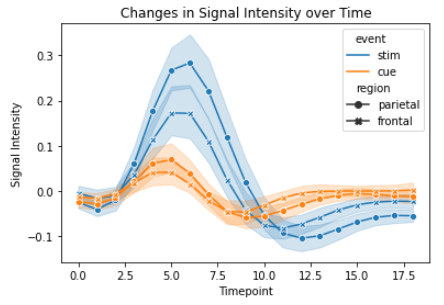
Again, I used Seaborn for the base line plot and Matplotlibfor the axis labels and title.
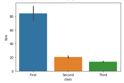
Bar plots are used to visualize the relationship between a categorical variable and a continuous variable. In a bar plot, each bar represents the mean or median (or any aggregation) of the continuous variable for each category.In Seaborn, bar plots can be created using the barplot() function. For more detail, see our Seaborn barplot guide.
import seaborn as sns

titanic = sns.load_dataset("titanic")
sns.barplot(x="class", y="fare", data=titanic)Output:
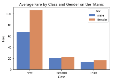
Let’s customize this plot by including `sex` column from the dataset.
import seaborn as sns
import matplotlib.pyplot as plt

titanic = sns.load_dataset("titanic")

# customize the bar plot
sns.barplot(x="class", y="fare", hue="sex", errorbar=None, palette="muted", data=titanic)

# add labels and title
plt.xlabel("Class")
plt.ylabel("Fare")
plt.title("Average Fare by Class and Gender on the Titanic")

# display the plot
plt.show()Output:
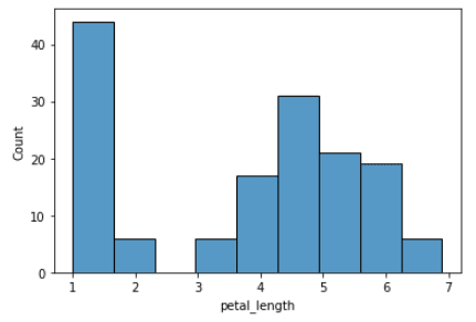
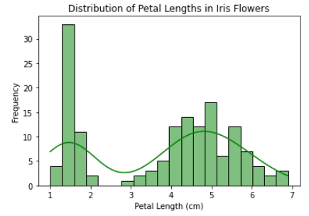
Histograms visualize the distribution of a continuous variable. In a histogram, the data is divided into bins and the height of each bin represents the frequency or count of data points within that bin.In Seaborn, histograms can be created using the histplot() function. Our Seaborn histogram guide covers this in more depth.
import seaborn as sns

iris = sns.load_dataset("iris")
sns.histplot(x="petal_length", data=iris)Output:
import seaborn as sns
import matplotlib.pyplot as plt

iris = sns.load_dataset("iris")

# customize the histogram
sns.histplot(data=iris, x="petal_length", bins=20, kde=True, color="green")

# add labels and title
plt.xlabel("Petal Length (cm)")
plt.ylabel("Frequency")
plt.title("Distribution of Petal Lengths in Iris Flowers")

# display the plot
plt.show()Output:
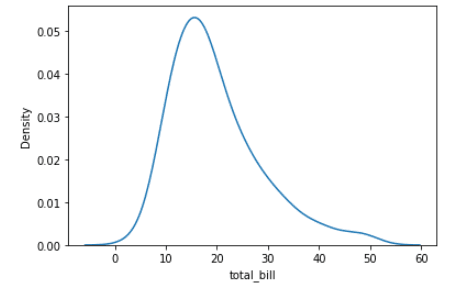
Density plots (also called kernel density estimate or KDE plots) display the distribution of a continuous variable as a smooth curve instead of discrete bins. They’re useful when you want to compare distributions without the bin-size sensitivity of histograms. In Seaborn, create them with kdeplot().
import seaborn as sns

tips = sns.load_dataset("tips")

sns.kdeplot(data=tips, x="total_bill")Output:
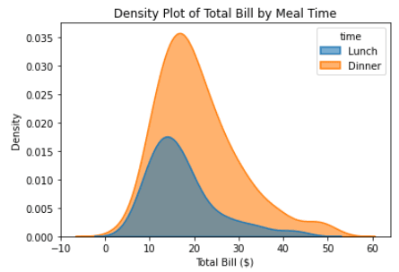
Let’s improve the plot by customizing it.
import seaborn as sns
import matplotlib.pyplot as plt

# Load the "tips" dataset from Seaborn
tips = sns.load_dataset("tips")

# Create a density plot of the "total_bill" column from the "tips" dataset
# We use the "hue" parameter to differentiate between "lunch" and "dinner" meal times
# We use the "fill" parameter to fill the area under the curve
# We adjust the "alpha" and "linewidth" parameters to make the plot more visually appealing
sns.kdeplot(data=tips, x="total_bill", hue="time", fill=True, alpha=0.6, linewidth=1.5)

# Add a title and labels to the plot using Matplotlib
plt.title("Density Plot of Total Bill by Meal Time")
plt.xlabel("Total Bill ($)")
plt.ylabel("Density")

# Show the plot
plt.show()Output:
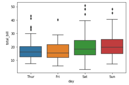
Box plots are a type of visualization that shows the distribution of a dataset. They are commonly used to compare the distribution of one or more variables across different categories.
import seaborn as sns

tips = sns.load_dataset("tips")

sns.boxplot(x="day", y="total_bill", data=tips)Output:
Customize the box plot by including `time` column from the dataset.
import seaborn as sns
import matplotlib.pyplot as plt

# load the tips dataset from Seaborn
tips = sns.load_dataset("tips")

# create a box plot of total bill by day and meal time, using the "hue" parameter to differentiate between lunch and dinner
# customize the color scheme using the "palette" parameter
# adjust the linewidth and fliersize parameters to make the plot more visually appealing
sns.boxplot(x="day", y="total_bill", hue="time", data=tips, palette="Set3", linewidth=1.5, fliersize=4)

# add a title, xlabel, and ylabel to the plot using Matplotlib functions
plt.title("Box Plot of Total Bill by Day and Meal Time")
plt.xlabel("Day of the Week")
plt.ylabel("Total Bill ($)")

# display the plot
plt.show()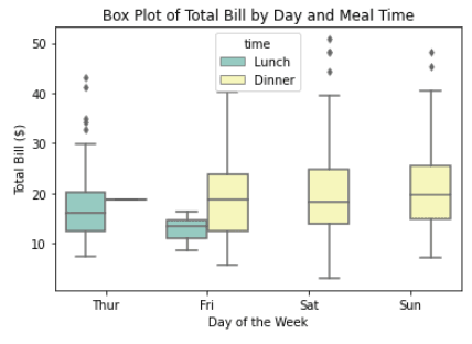
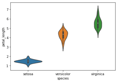
A violin plot is a type of data visualization that combines aspects of both box plots and density plots. It displays a density estimate of the data, usually smoothed by a kernel density estimator, along with the interquartile range (IQR) and median in a box plot-like form.
The width of the violin represents the density estimate, with wider parts indicating higher density, and the IQR and median are shown as a white dot and line within the violin.
import seaborn as sns
import matplotlib.pyplot as plt

iris = sns.load_dataset("iris")

sns.violinplot(x="species", y="petal_length", data=iris)
plt.show()Output:
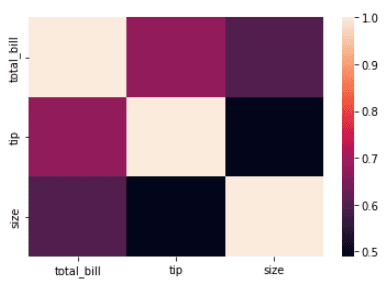
A heatmap uses colors to represent values in a matrix. In data analysis, heatmaps are commonly used to visualize correlation matrices. Our Seaborn heatmaps guide covers advanced customization options.
import seaborn as sns
import matplotlib.pyplot as plt

# Load the dataset
tips = sns.load_dataset('tips')

# Create a heatmap of the correlation between variables
corr = tips.select_dtypes(include="number").corr()
sns.heatmap(corr, annot=True, cmap="coolwarm")

# Show the plot
plt.show()Output:
Another example of a heatmap using the `flights` dataset.
import seaborn as sns
import matplotlib.pyplot as plt

# Load the dataset
flights = sns.load_dataset('flights')

# Pivot the data
flights = flights.pivot(index="month", columns="year", values="passengers")

# Create a heatmap
sns.heatmap(flights, cmap='Blues', annot=True, fmt='d')

# Set the title and axis labels
plt.title('Passengers per month')
plt.xlabel('Year')
plt.ylabel('Month')

# Show the plot
plt.show()Output:
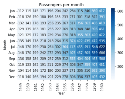
In this example, we are using the `flights` dataset from the `seaborn` library. We pivot the data to make it suitable for heatmap representation using the .pivot() method. Then, we create a heatmap using the sns.heatmap() function and pass the pivoted flights variable as the argument.
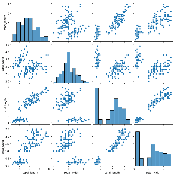
Pair plots are a type of visualization in which multiple pairwise scatter plots are displayed in a matrix format. Each scatter plot shows the relationship between two variables, while the diagonal plots show the distribution of the individual variables.
import seaborn as sns

# Load iris dataset
iris = sns.load_dataset("iris")

# Create pair plot
sns.pairplot(data=iris)

# Show plot
plt.show()Output:
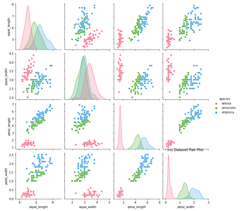
We can customize this plot by using `hue` and `diag_kind` parameter.
import seaborn as sns
import matplotlib.pyplot as plt

# Load iris dataset
iris = sns.load_dataset("iris")

# Create pair plot with custom settings
sns.pairplot(data=iris, hue="species", diag_kind="kde", palette="husl")

# Set title
plt.title("Iris Dataset Pair Plot")

# Show plot
plt.show()Output:
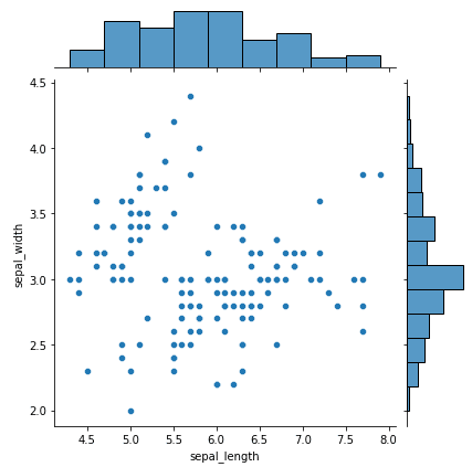
A joint plot combines a scatter plot (center) with marginal histograms (top and right edges) in a single figure. This layout shows both the relationship between two variables and their individual distributions at a glance.
Here is a simple example of building a seaborn joint plot using the iris dataset:
import seaborn as sns
import matplotlib.pyplot as plt

# load iris dataset
iris = sns.load_dataset("iris")

# plot a joint plot of sepal length and sepal width
sns.jointplot(x="sepal_length", y="sepal_width", data=iris)

# display the plot
plt.show()Output:
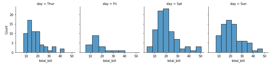
FacetGrid creates a grid of subplots—one per unique value in a categorical variable. This lets you compare the same plot across groups (e.g., total bill distributions for each day of the week).
import seaborn as sns

# load the tips dataset
tips = sns.load_dataset('tips')

# create a FacetGrid for day vs total_bill
g = sns.FacetGrid(tips, col="day")

# plot histogram for total_bill in each day
g.map(sns.histplot, "total_bill")Output:
|
Python Seaborn Cheat Sheet |
Seaborn provides five built-in themes that control the overall look of your plots. Call sns.set_theme() at the top of your script to apply one globally:
import seaborn as sns

sns.set_theme(style="whitegrid")  # options: darkgrid, whitegrid, dark, white, ticks
You can also control the scale of plot elements with the context parameter. This adjusts font sizes, line widths, and other elements for different output formats:
sns.set_theme(style="whitegrid", context="talk") # options: paper, notebook, talk, posterThe "notebook" context (the default) works well for Jupyter notebooks, while "talk" and "poster" scale everything up for presentations.
Beyond the default styling, Seaborn gives you control over color palettes, figure sizes, themes, and annotations. Here are the most common customizations:
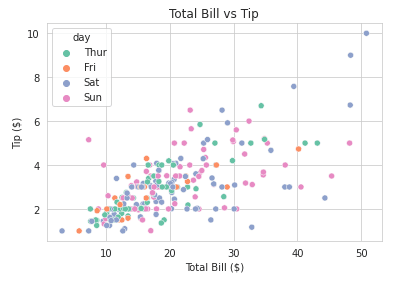
Here is an example of how you can change the color palettes of your seaborn plots:
import seaborn as sns
import matplotlib.pyplot as plt

# Load sample dataset
tips = sns.load_dataset("tips")

# Create a scatter plot with color palette
sns.scatterplot(x="total_bill", y="tip", hue="day", data=tips, palette="Set2")

# Customize plot
plt.title("Total Bill vs Tip")
plt.xlabel("Total Bill ($)")
plt.ylabel("Tip ($)")
plt.show()Output:
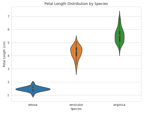
To adjust the figure size on your seaborn plots, you can use the example below as a guide:
import seaborn as sns
import matplotlib.pyplot as plt

# Load sample dataset
iris = sns.load_dataset("iris")

# Create a violin plot with adjusted figure size
plt.figure(figsize=(8,6))
sns.violinplot(x="species", y="petal_length", data=iris)

# Customize plot
plt.title("Petal Length Distribution by Species")
plt.xlabel("Species")
plt.ylabel("Petal Length (cm)")
plt.show()Output:
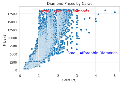
Annotations can help to make your visualizations easier to read. We've shown an example of how to add them below:
import seaborn as sns
import matplotlib.pyplot as plt

# Load sample dataset
diamonds = sns.load_dataset("diamonds")

# Create a scatter plot with annotations
sns.scatterplot(x="carat", y="price", data=diamonds)

# Add annotations
plt.text(1, 18000, "Large, Expensive Diamonds", fontsize=12, color="red")
plt.text(2.5, 5000, "Small, Affordable Diamonds", fontsize=12, color="blue")

# Customize plot
plt.title("Diamond Prices by Carat")
plt.xlabel("Carat (ct)")
plt.ylabel("Price ($)")
plt.show()Output:
Here are a few best practices to keep in mind to get the best out of Seaborn.
Seaborn provides a wide range of plot types, each designed for different types of data and analysis. It's important to choose the right plot type for your data to effectively communicate your findings. For example, a scatter plot may be more appropriate for visualizing the relationship between two continuous variables, while a bar plot may be more appropriate for visualizing categorical data.
Color can be a powerful tool for data visualization, but it's important to use it effectively. Avoid using too many colors or overly bright colors, as this can make the visualization difficult to read. Instead, use color to highlight important information or to group similar data points.
Labels and titles are essential for effective data visualization. Make sure to label your axes clearly and provide a descriptive title for your visualization. This will help your audience understand the message you are trying to convey.
When creating visualizations, it's important to consider the audience and the message you are trying to communicate. If your audience is non-technical, use clear and concise language, avoid technical jargon, and provide clear explanations of any statistical concepts.
Seaborn provides a range of statistical functions that you can use to analyze your data. When choosing a statistical function, make sure to choose the one that is most appropriate for your data and research question.
You’ll find a wide range of customization options in Seaborn that you can use to enhance your visualizations. Experiment with different fonts, styles, and colors to find the one that best communicates your message.
Building on what we established, let's see how Seaborn stacks up against Matplotlib and two other alternatives you’ll encounter, and which library suits which use case:
| Library | Strengths | Limitations | Best for |
|---|---|---|---|
| Matplotlib | Full control over every figure element | Verbose; no built-in statistics | Custom, publication-quality figures |
pandas .plot() |
Quick plots from DataFrames with zero imports | Limited chart types; minimal styling | Fast exploratory checks |
| Plotly | Interactive; web-embeddable; 3D support | Heavier dependency; learning curve for customization | Dashboards, web apps, interactive reports |
| Seaborn | Statistical defaults; clean API; pandas integration | Static only; less flexible than raw Matplotlib | Exploratory data analysis, statistical plots |
For most data analysis work, I use Seaborn for the initial exploration, Matplotlib for fine-tuning, and Plotly when the output needs to be interactive. They’re not mutually exclusive.
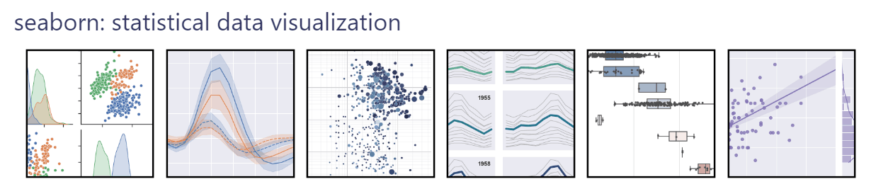
Seaborn is a powerful data visualization library in Python that provides an intuitive and easy-to-use interface for creating informative statistical graphics. With its vast array of visualization tools, Seaborn makes it possible to quickly and efficiently explore and communicate insights from complex data sets.
From scatter plots and line plots to heatmaps and facet grids, Seaborn offers a wide range of visualizations to suit different needs. Moreover, Seaborn's ability to integrate with Pandas and Numpy makes it an indispensable tool for data analysts and scientists.
With this beginner's guide to Python Seaborn, you can start exploring the world of data visualization and communicate your insights effectively to a broader audience.
If you would like to further broaden your knowledge in this topic, check out our Introduction to Data Visualization with Seaborn or Intermediate Data Visualization with Seaborn courses.
Throughout these courses, you will learn how to utilize Seaborn's advanced visualization tools to analyze various real-world datasets, such as the American Housing Survey, college tuition data, and The Daily Show guests.
You can also check out our free Seaborn cheat sheet.
Learn Python with DataCamp!
Course
Course
Course
cheat-sheet
Karlijn Willems
Tutorial
Elena Kosourova
Tutorial
Rajesh Kumar
Tutorial
Joleen Bothma
Tutorial
Austin Chia
Tutorial
Austin Chia